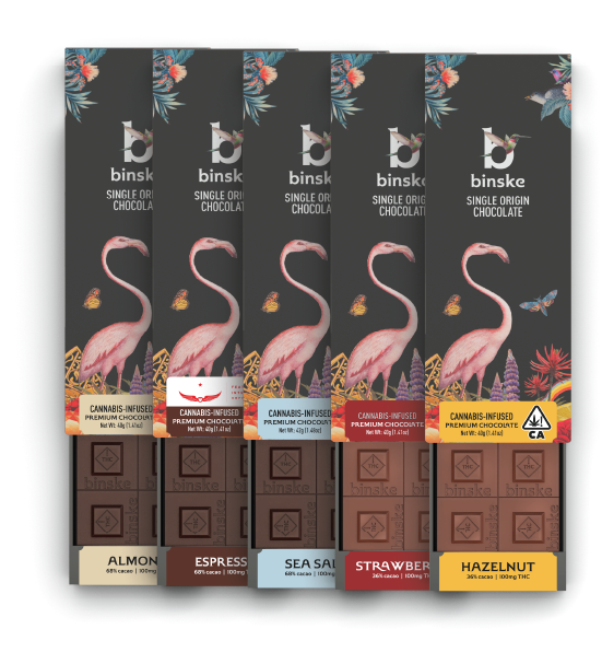
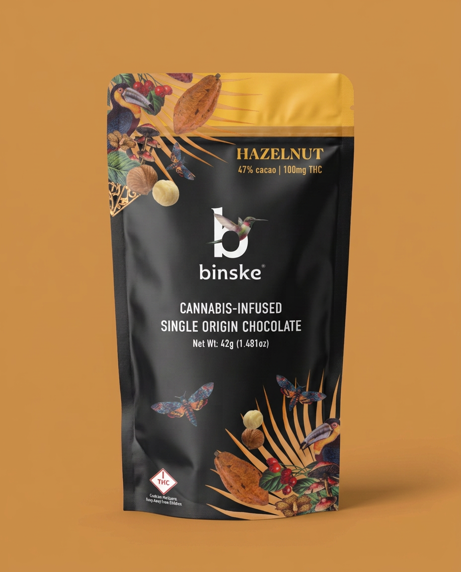
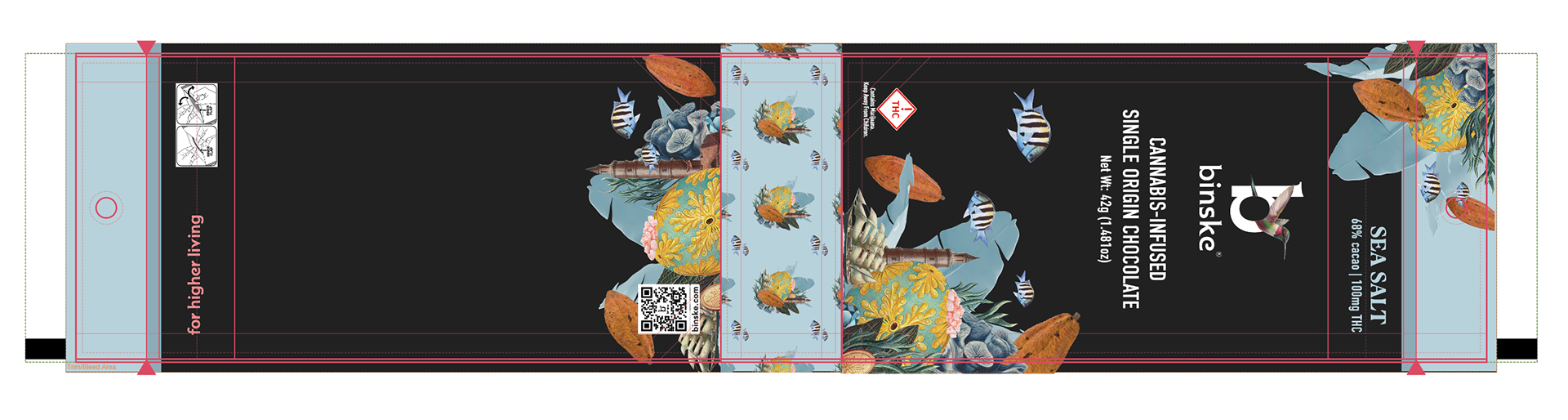
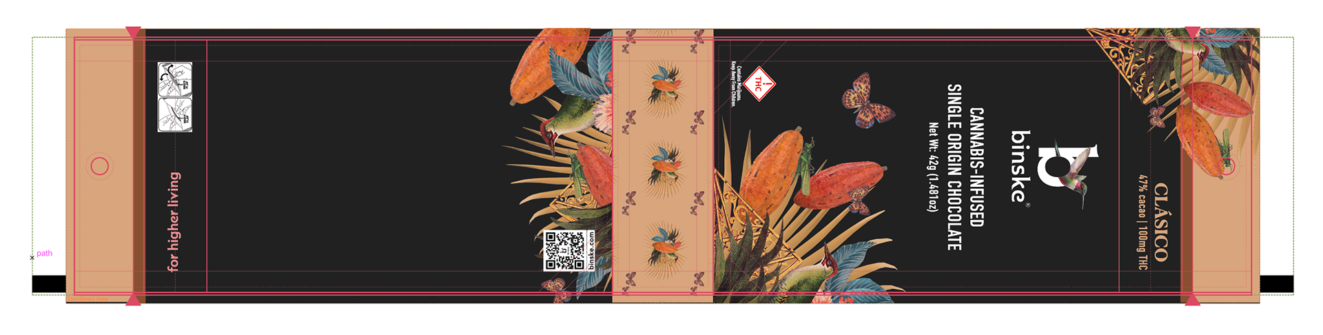
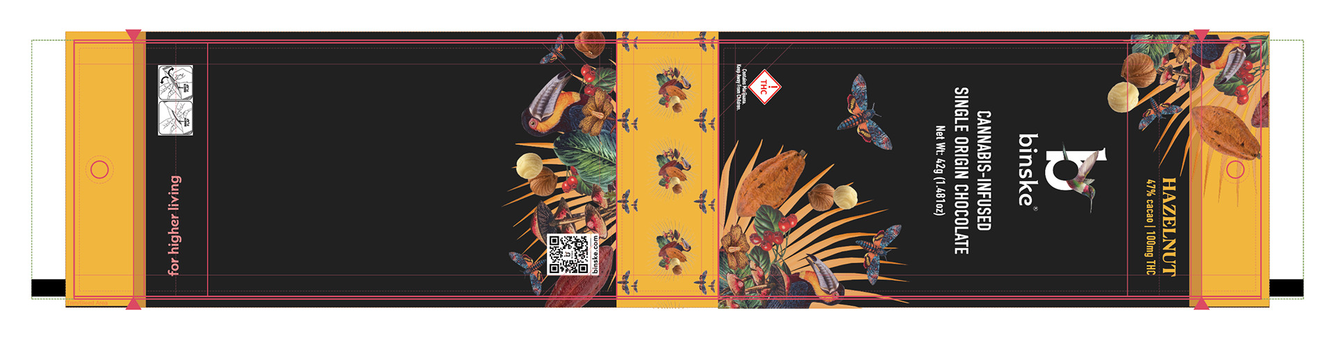
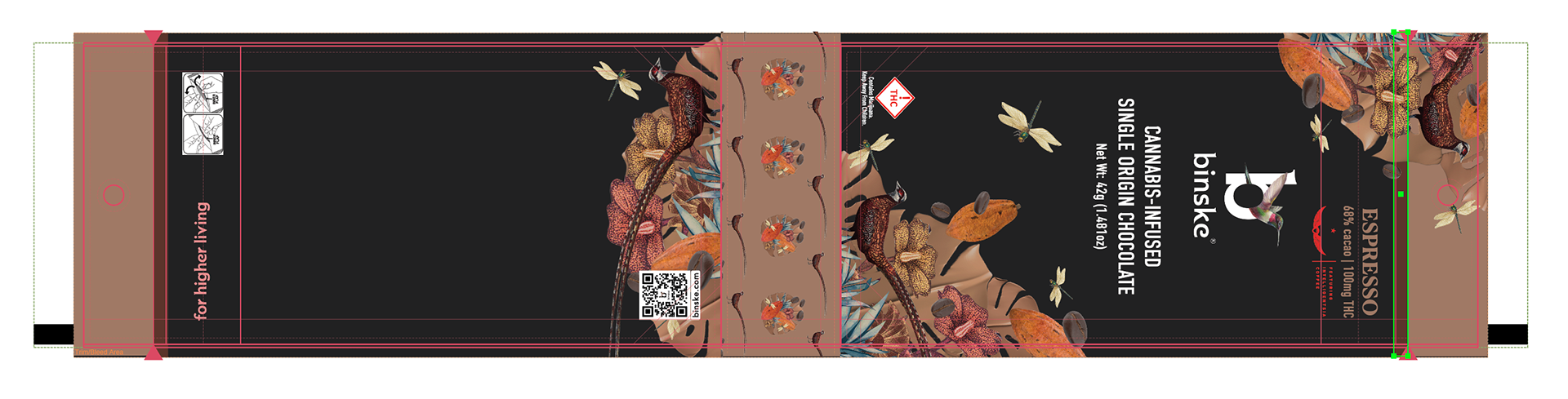
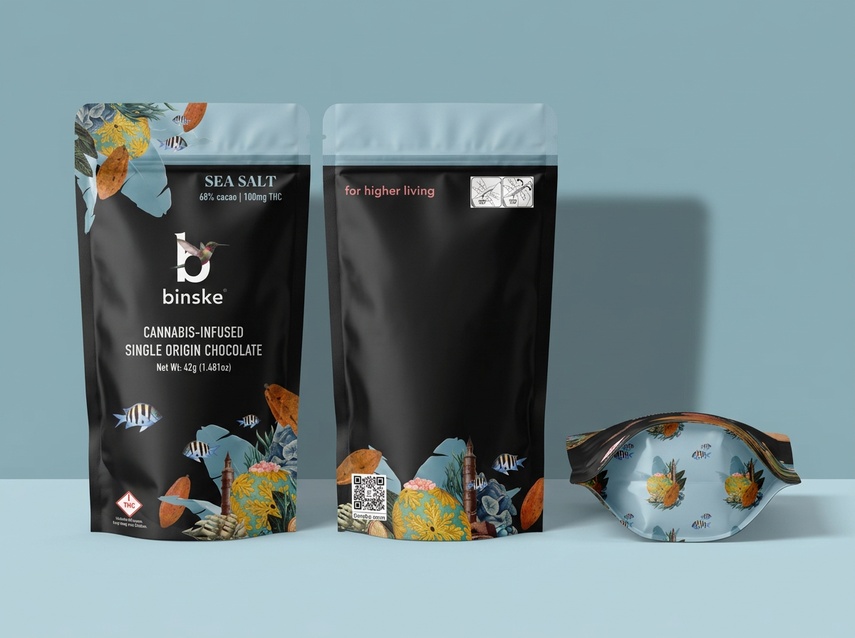
Project: Transition away from the standard binske trade dress and the cardboard chocolate bar packaging to a new flavor forward design in a mylar bag. Allowing room on the back for compliance statements and labels.
Before: binske had been using cardboard boxes with their traditional trade dress and a wrapper on the chocolate bars for each flavor. The only way to distinguish the flavor was on the tamper label.
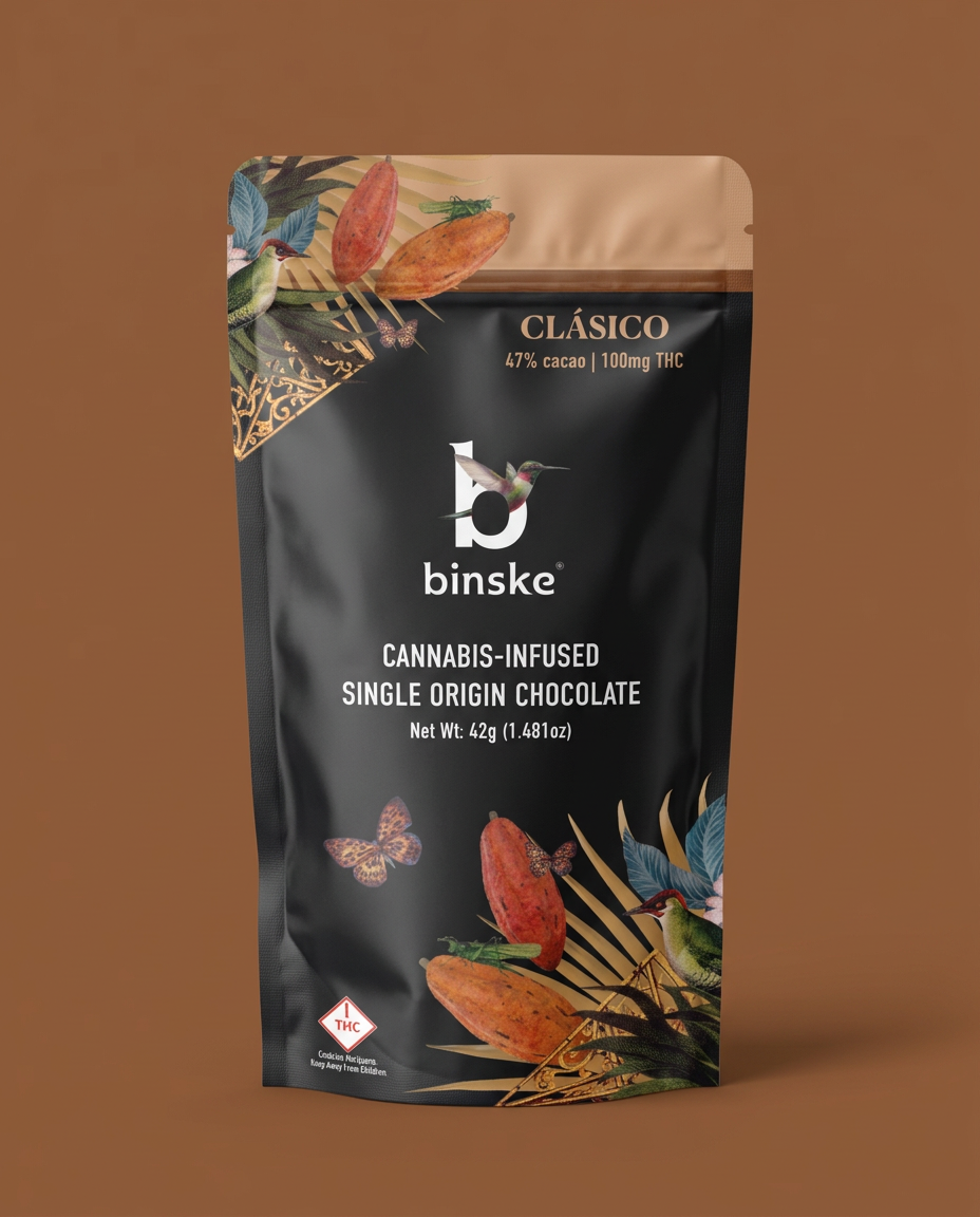
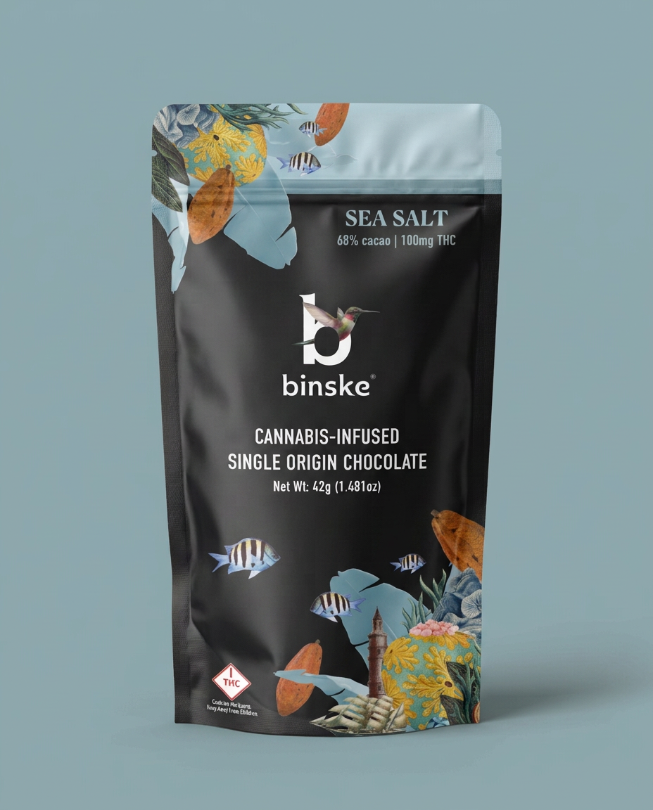
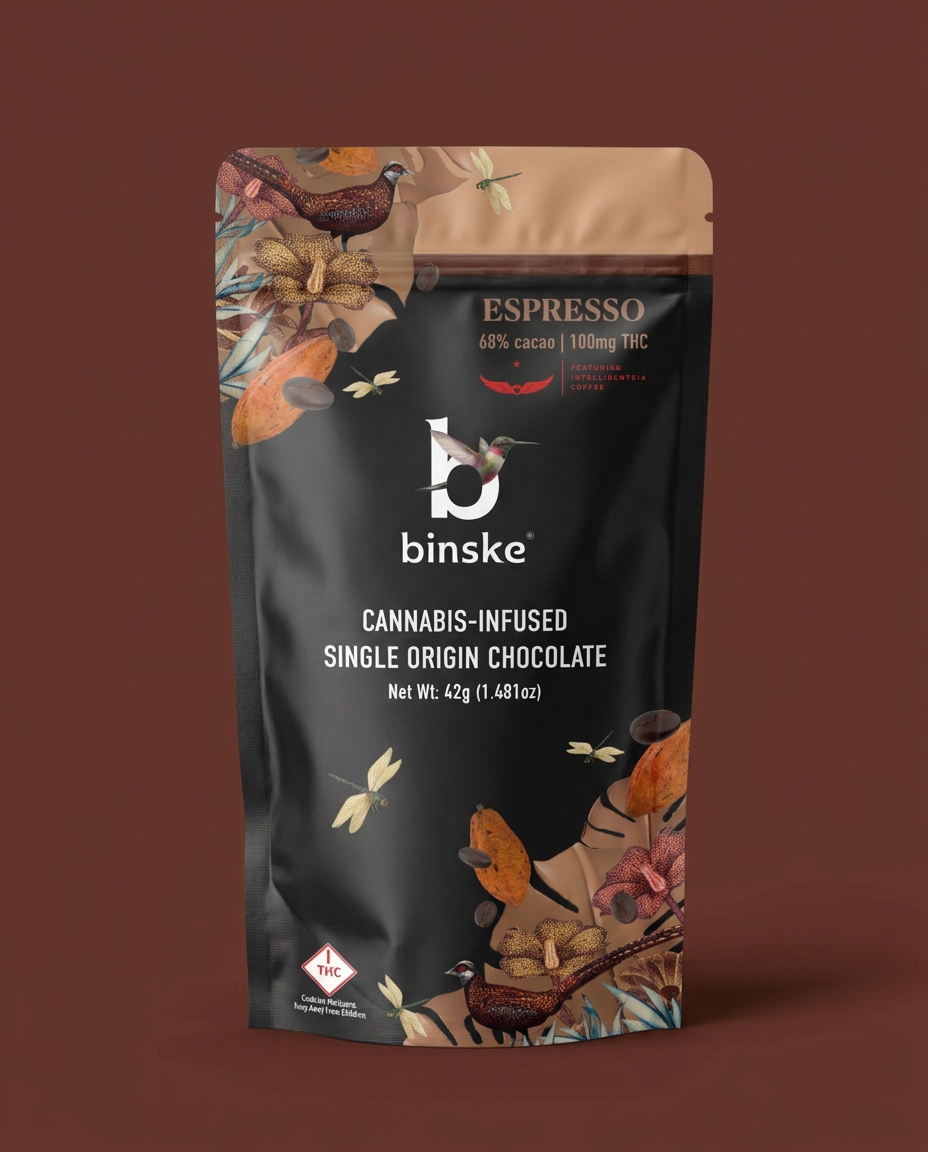
Solution: The bags were designed with a specific trade dress and color palette for each flavor. The flavor identifier to the top of the bag to be more prominent in hierarchy. The black background and logo branding was kept traditional to coordinate with the existing product line. The lower left corners were reserved for state compliance symbols. The backs were designed to accommodate compliance and labeling from many different markets.
Renders
Dielines

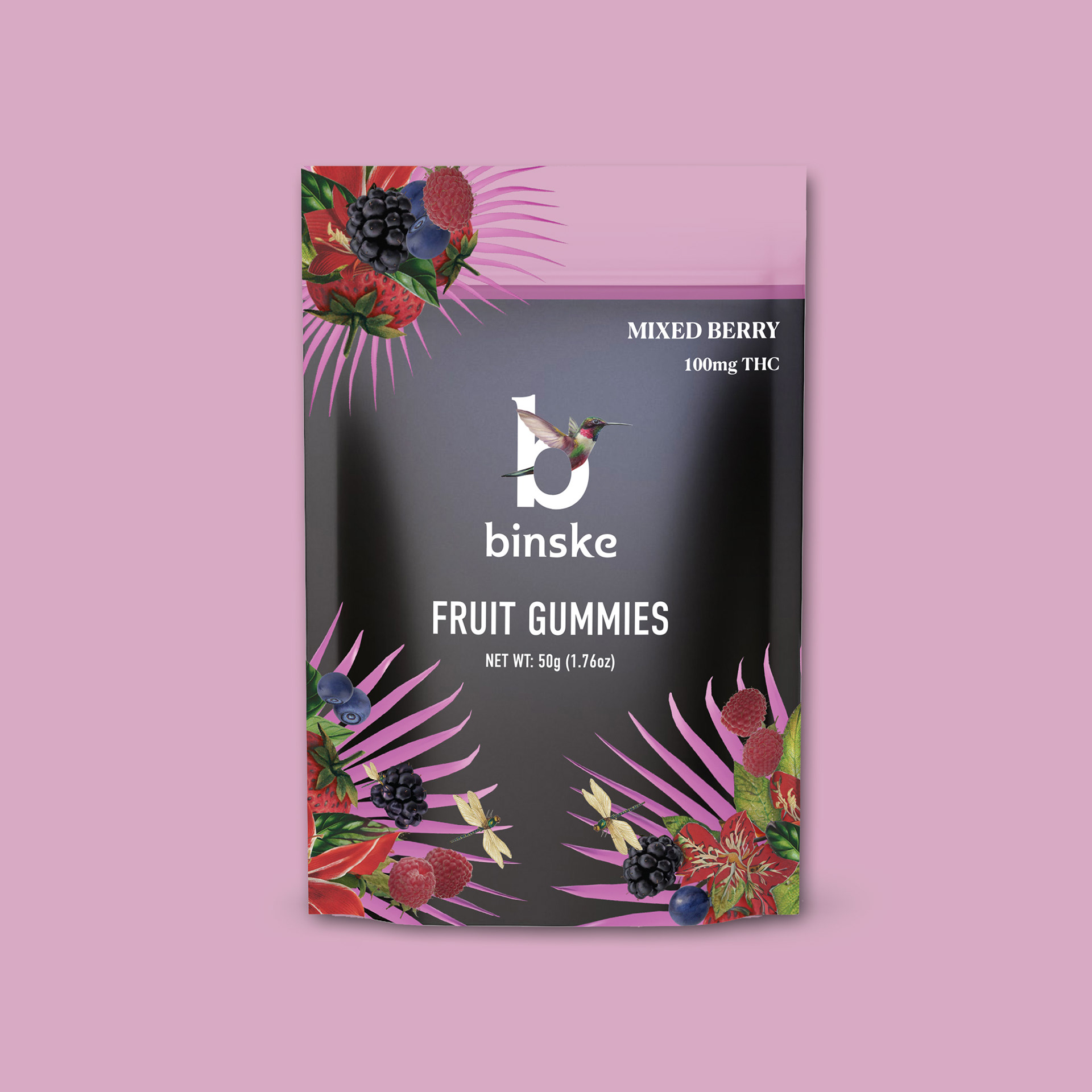
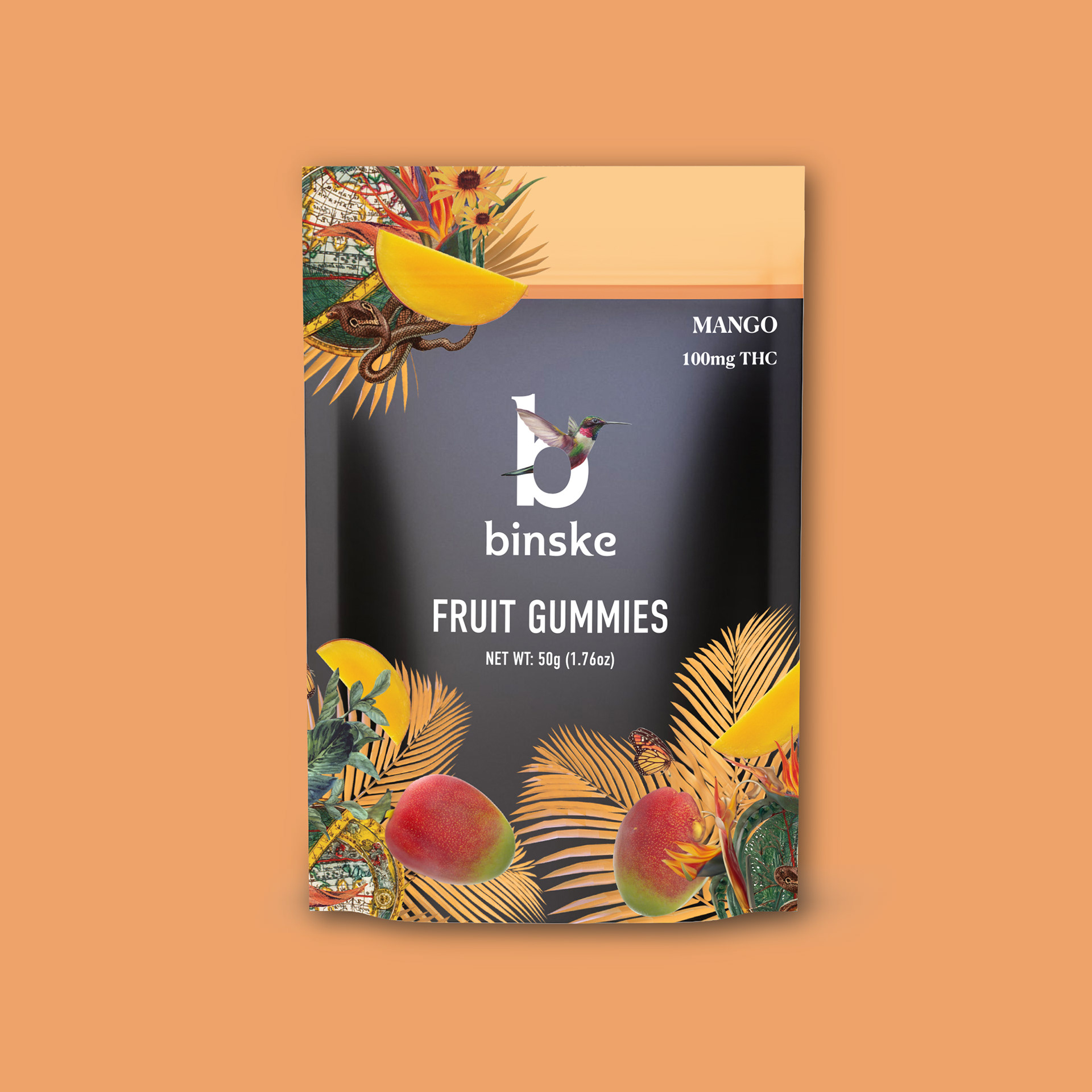
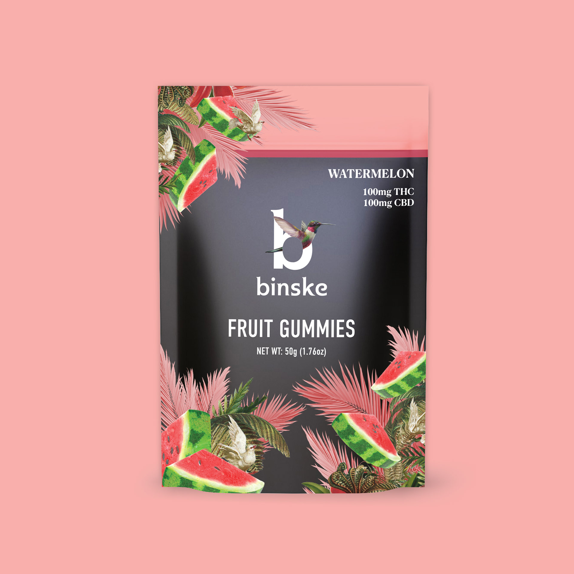
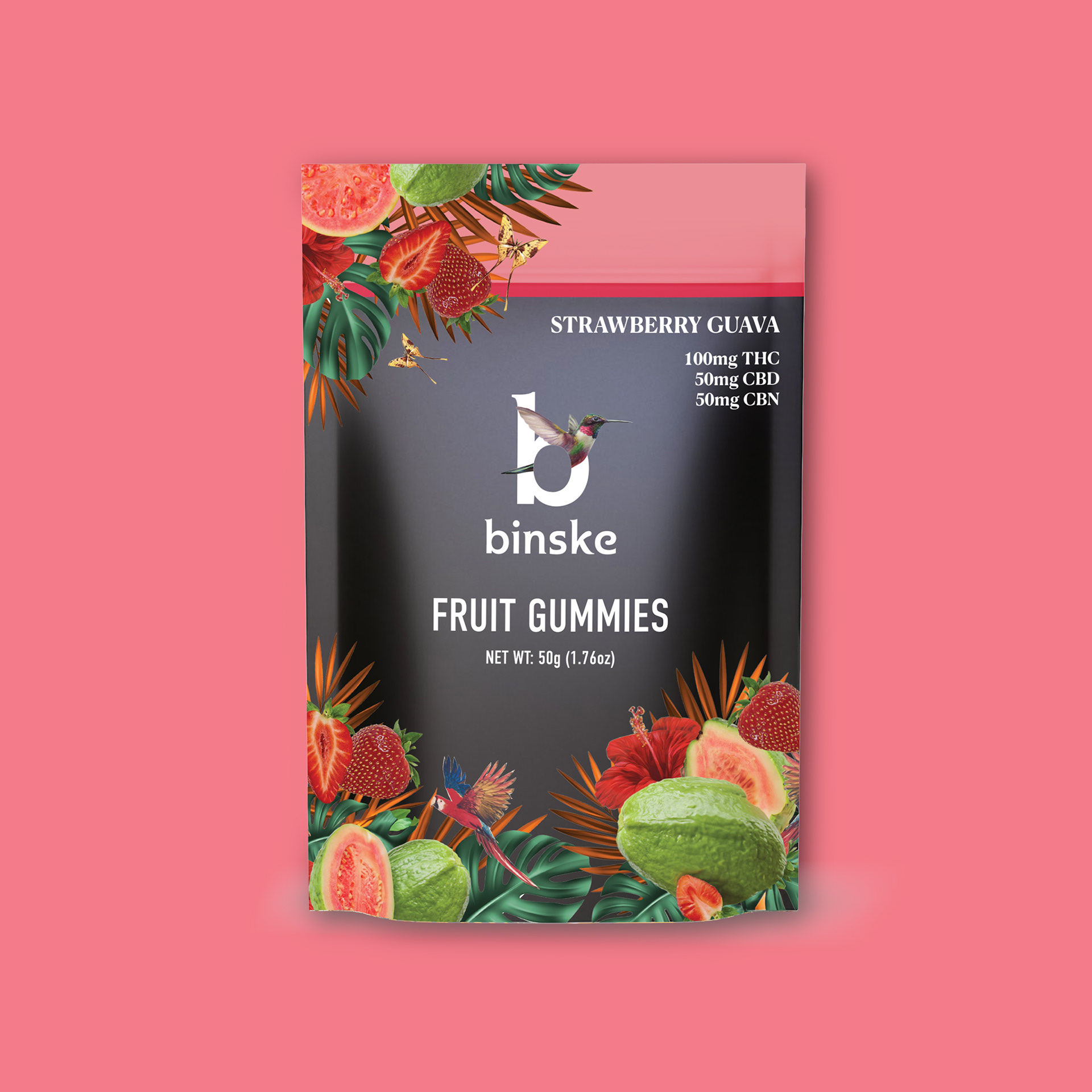
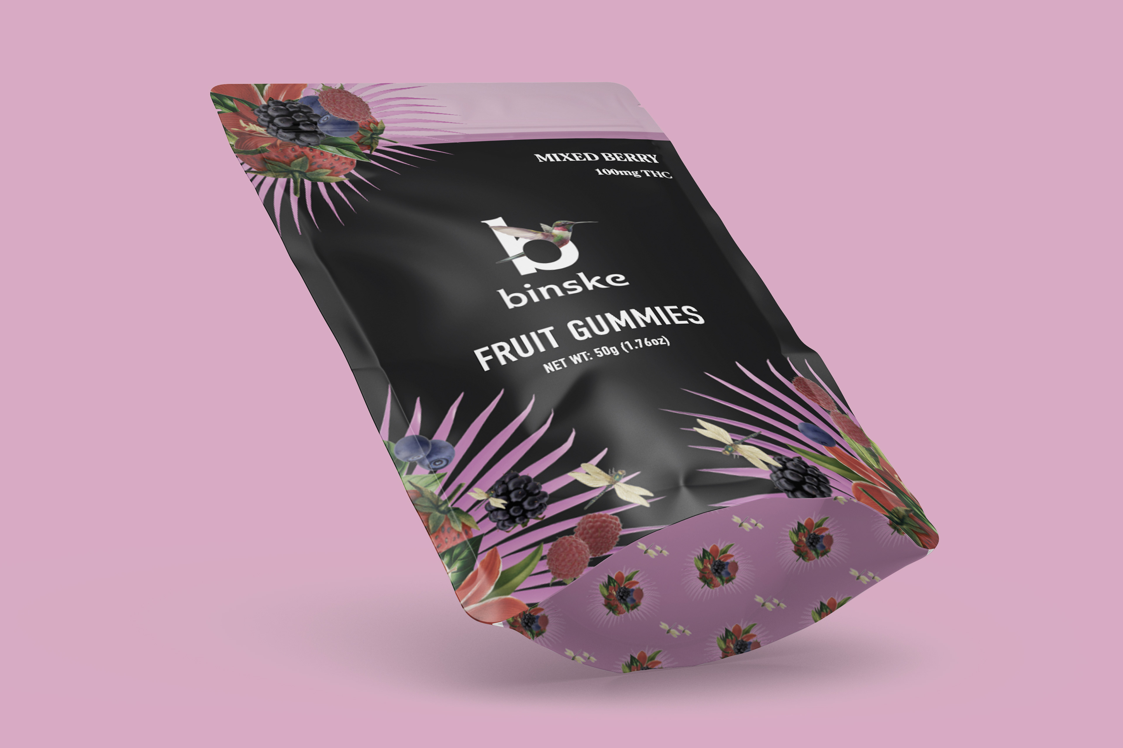
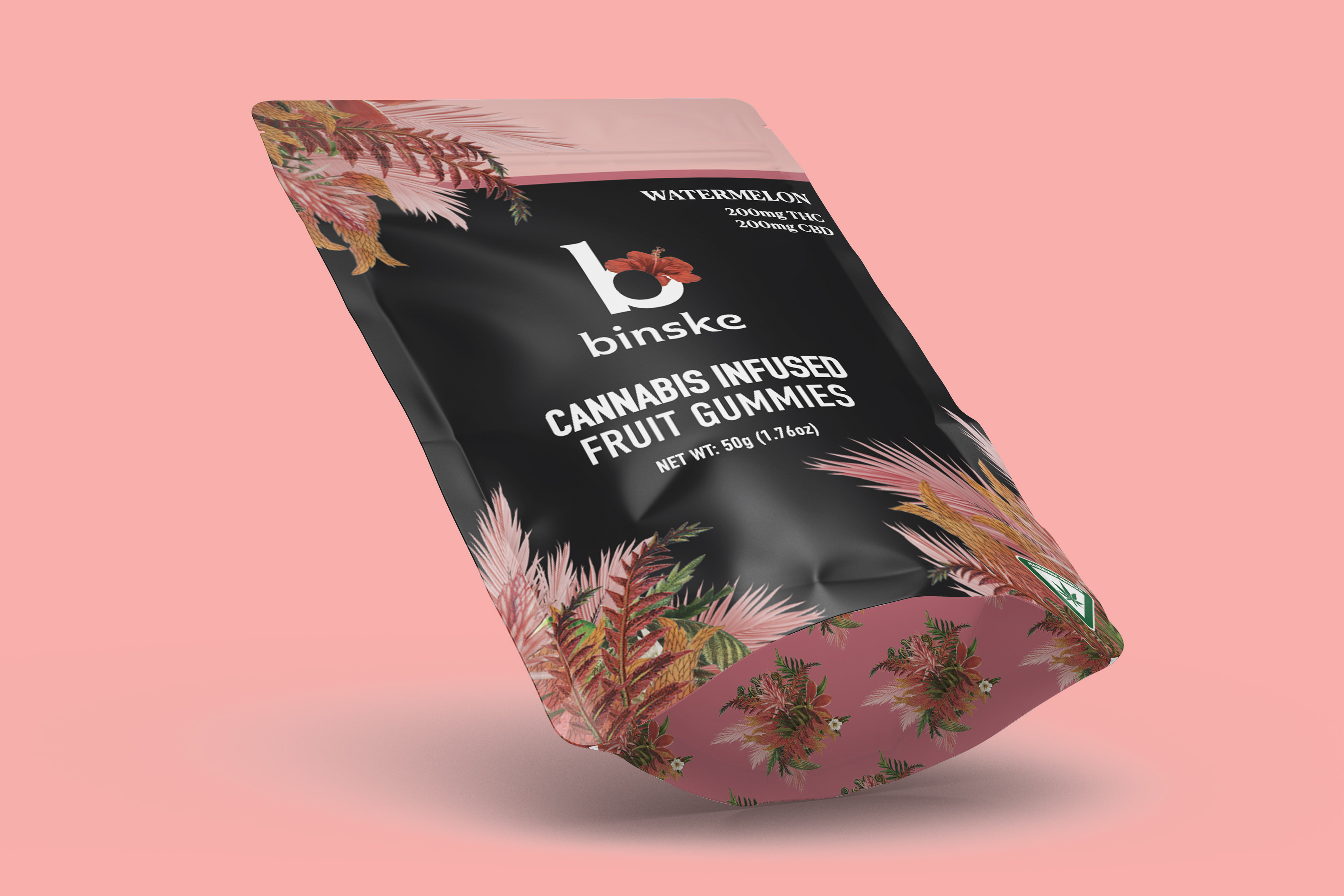
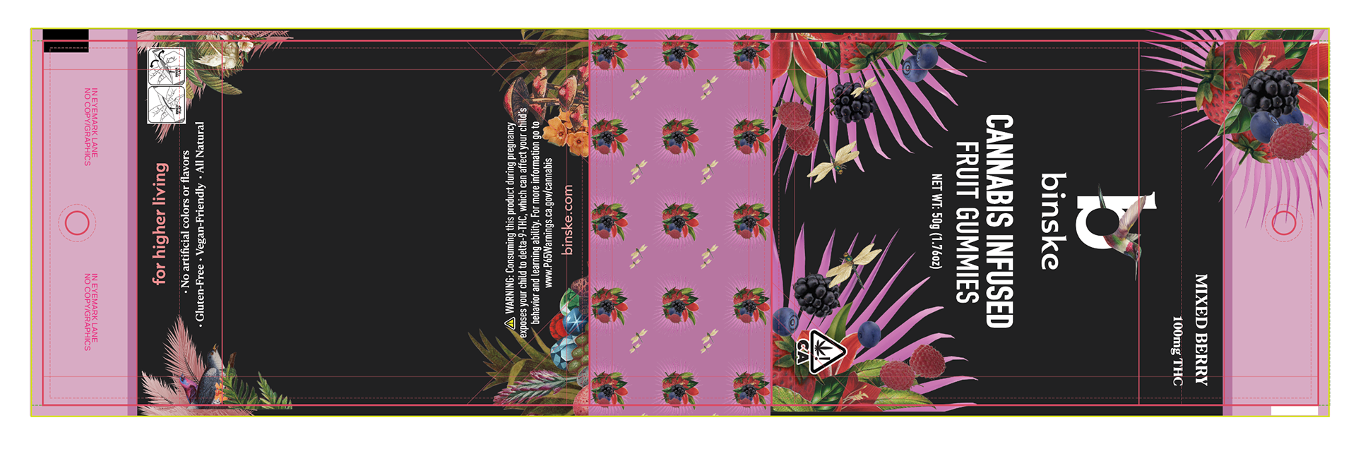
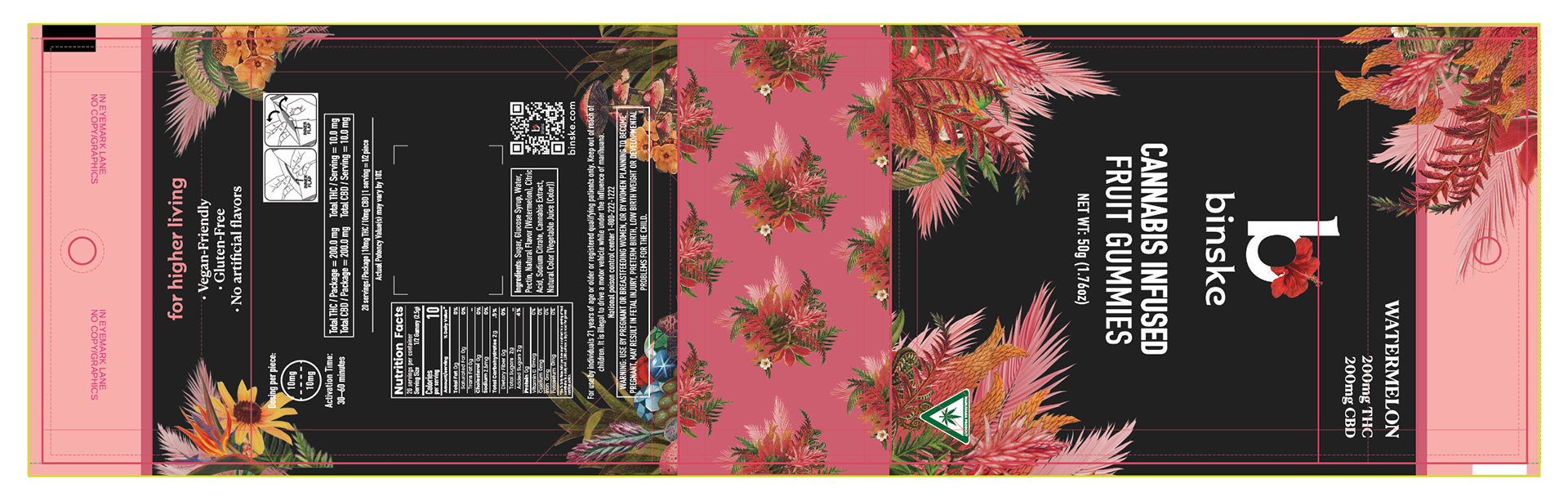
Project: In moving away from gummy tins packaging to resealable mylar bags, the brief requested to move away from the traditional trade dress that appeared identical on all flavors to a flavor forward design.
Before: binske had been using tins for their gummies for several years with their traditional trade dress for each flavor. The only way to distinguish the flavor was on the tamper label.
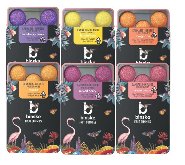
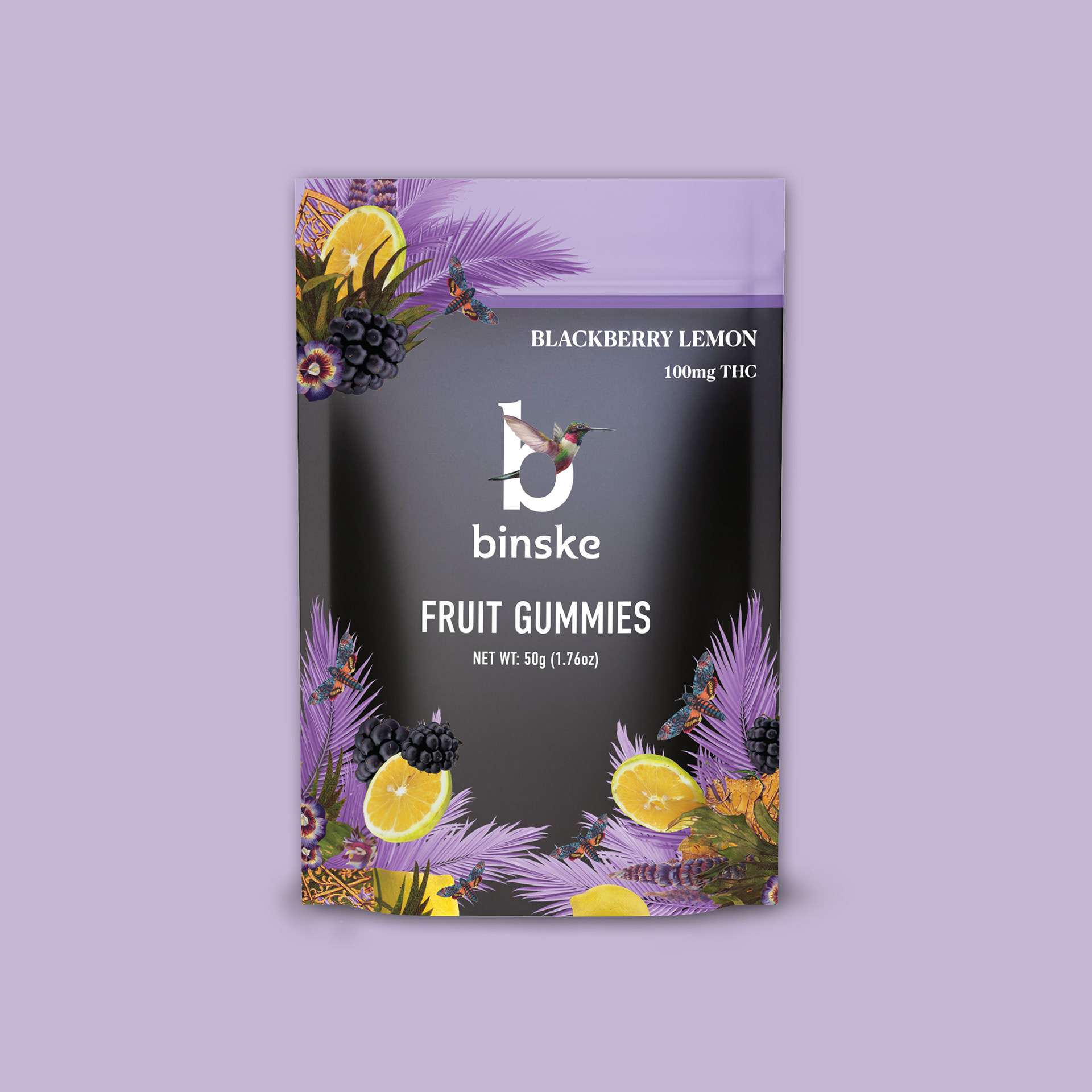
Solution: I kept the black background to coordinate the new packaging with the complete product catalog and continued the brand standards of branding and product name to align with other product categories. To highlight the flavor I utilized fruits, and a flavor associated color stripe to the top to quickly identify the flavor. Utilizing the binske brand floral elements I carefully selected for their specific color to align with a color profile I assigned to each flavor. This reinforced the brand as well as the flavor profile for the customer and allowed budtenders to quickly identify flavors in stock.
Renders
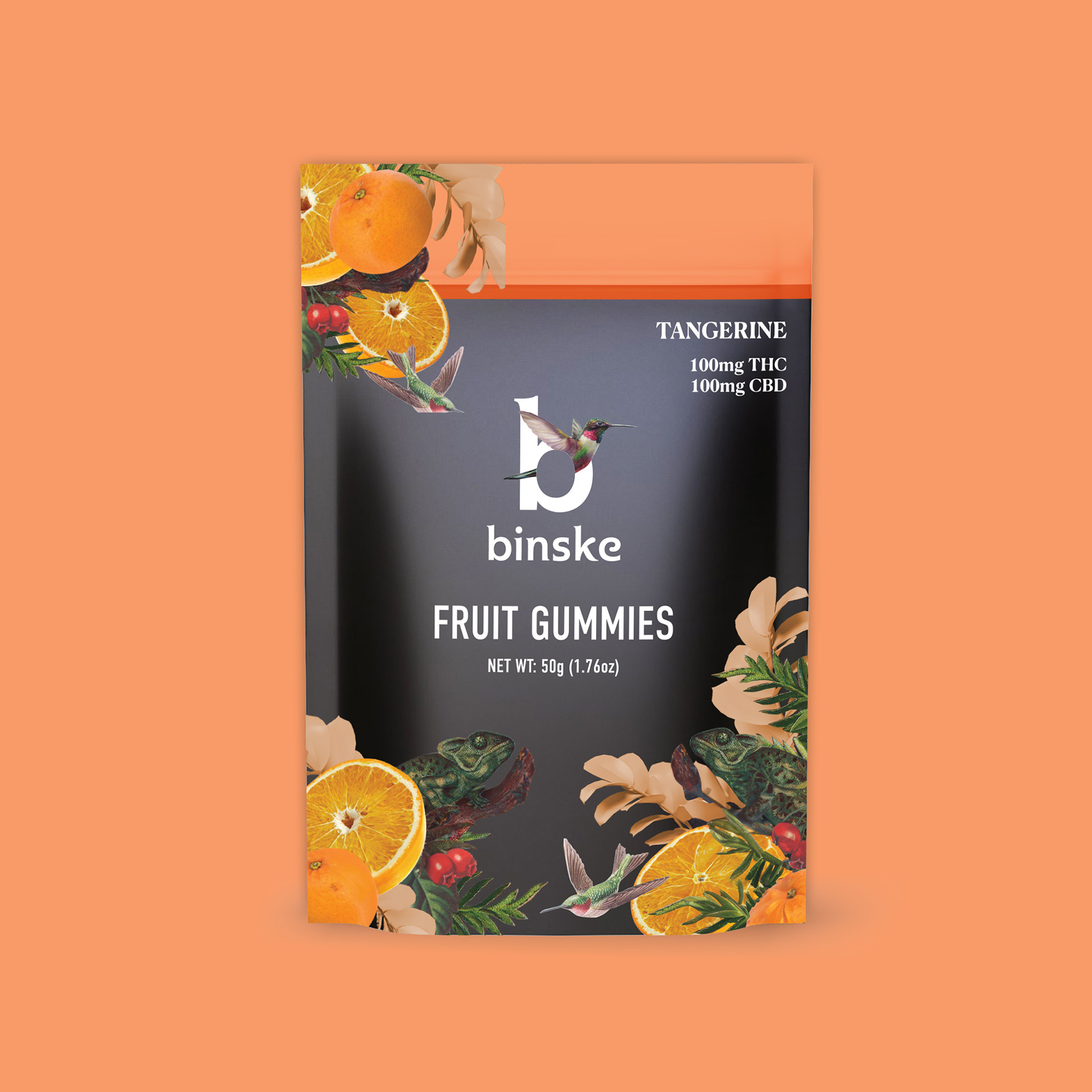
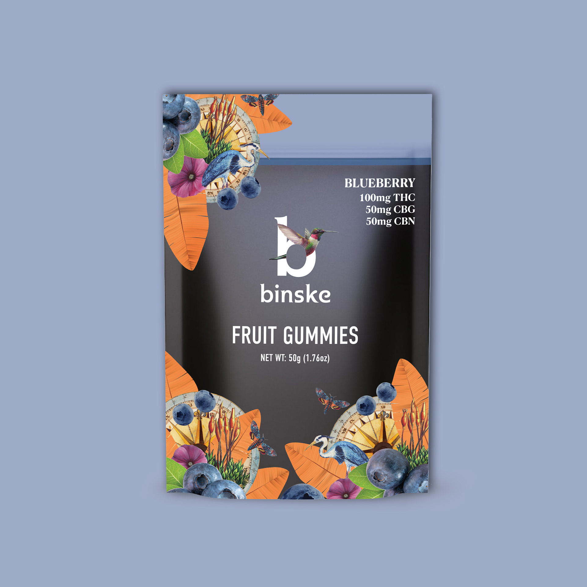
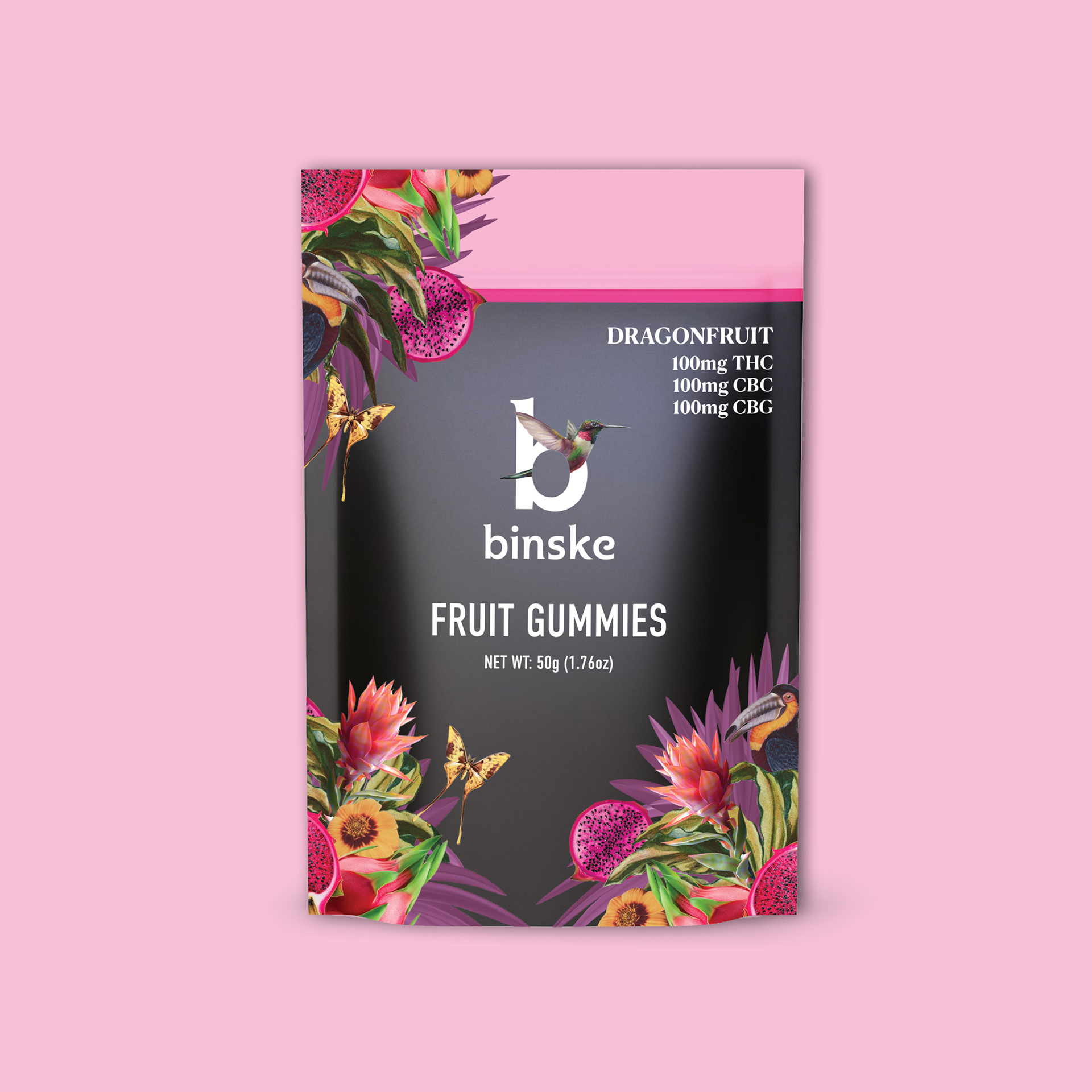
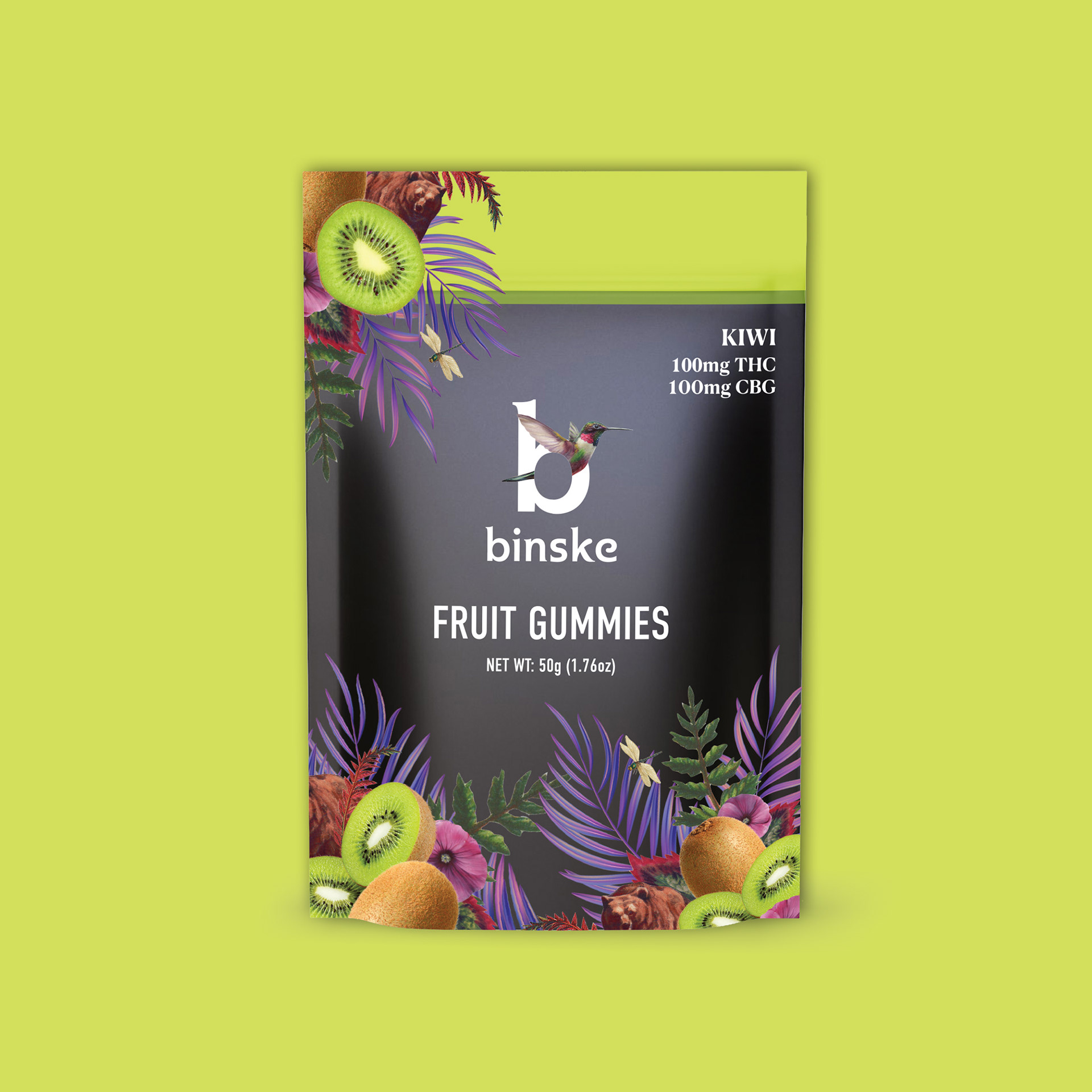
Dielines

Understanding Markets: Several markets that binske entered, following the redesign above, had regulations prohibiting fruit and animals on packaging. First I adopted the underutilized secondary logo paired with our traditional wordmark for brand cohesion and recognition by consumers across regulatory markets. Without another redesign, I adopted my designs into compliant packaging by removing fruits and animals and slightly adjusting the remaining elements.
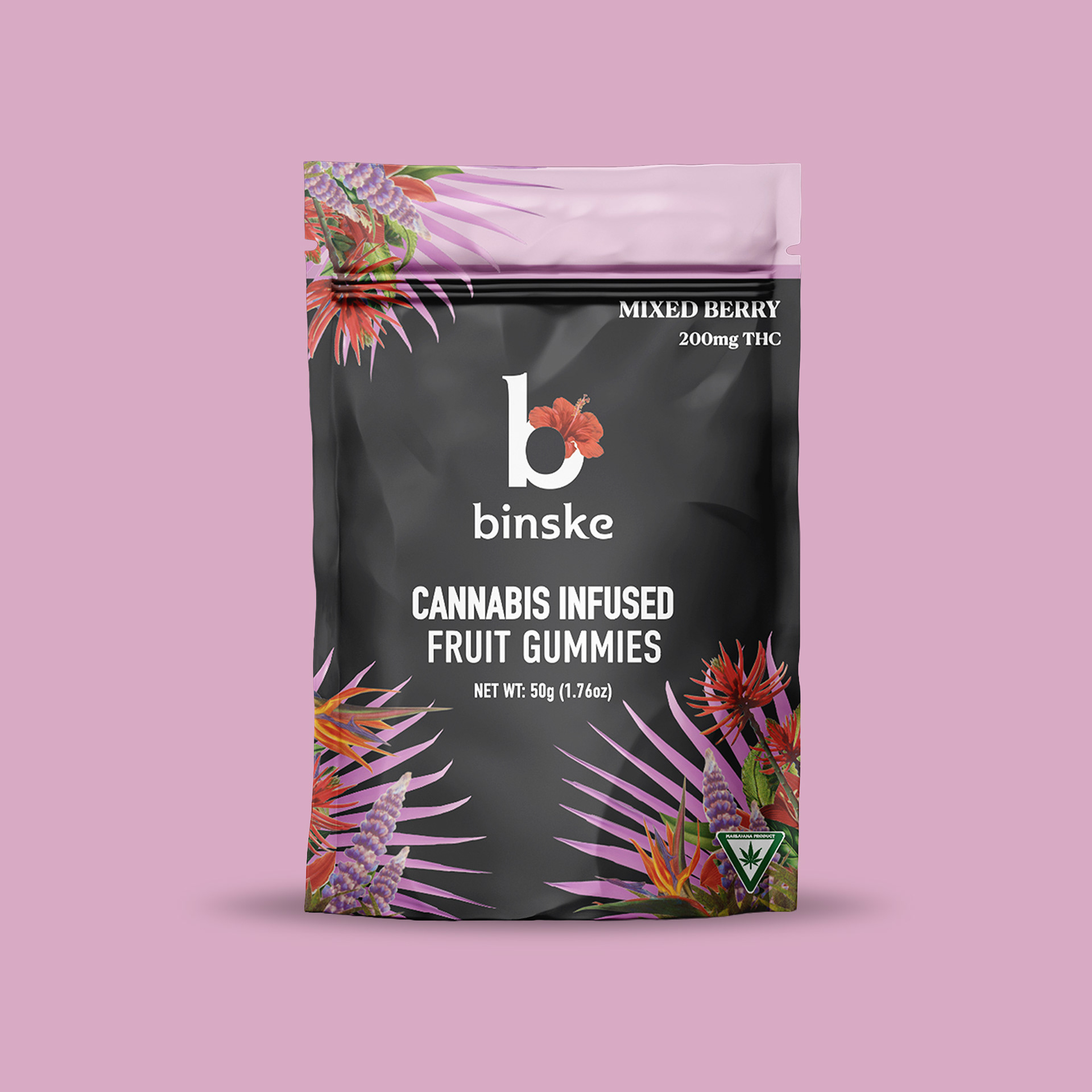
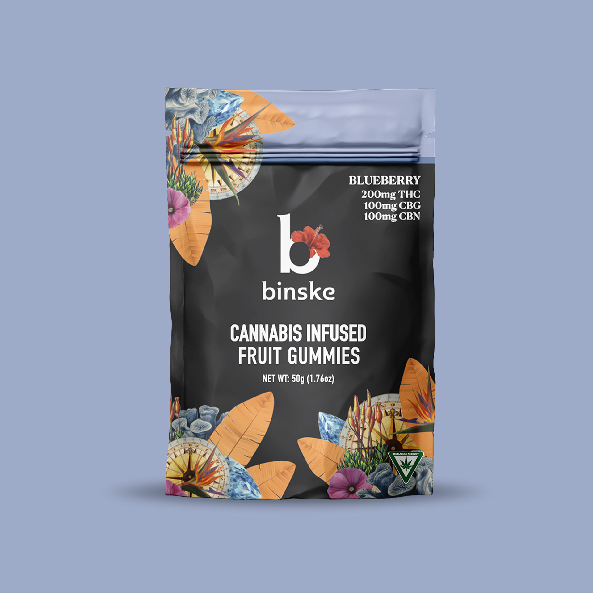
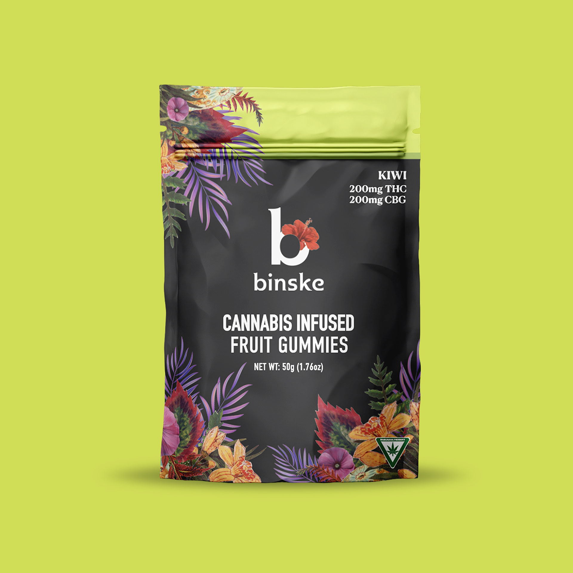
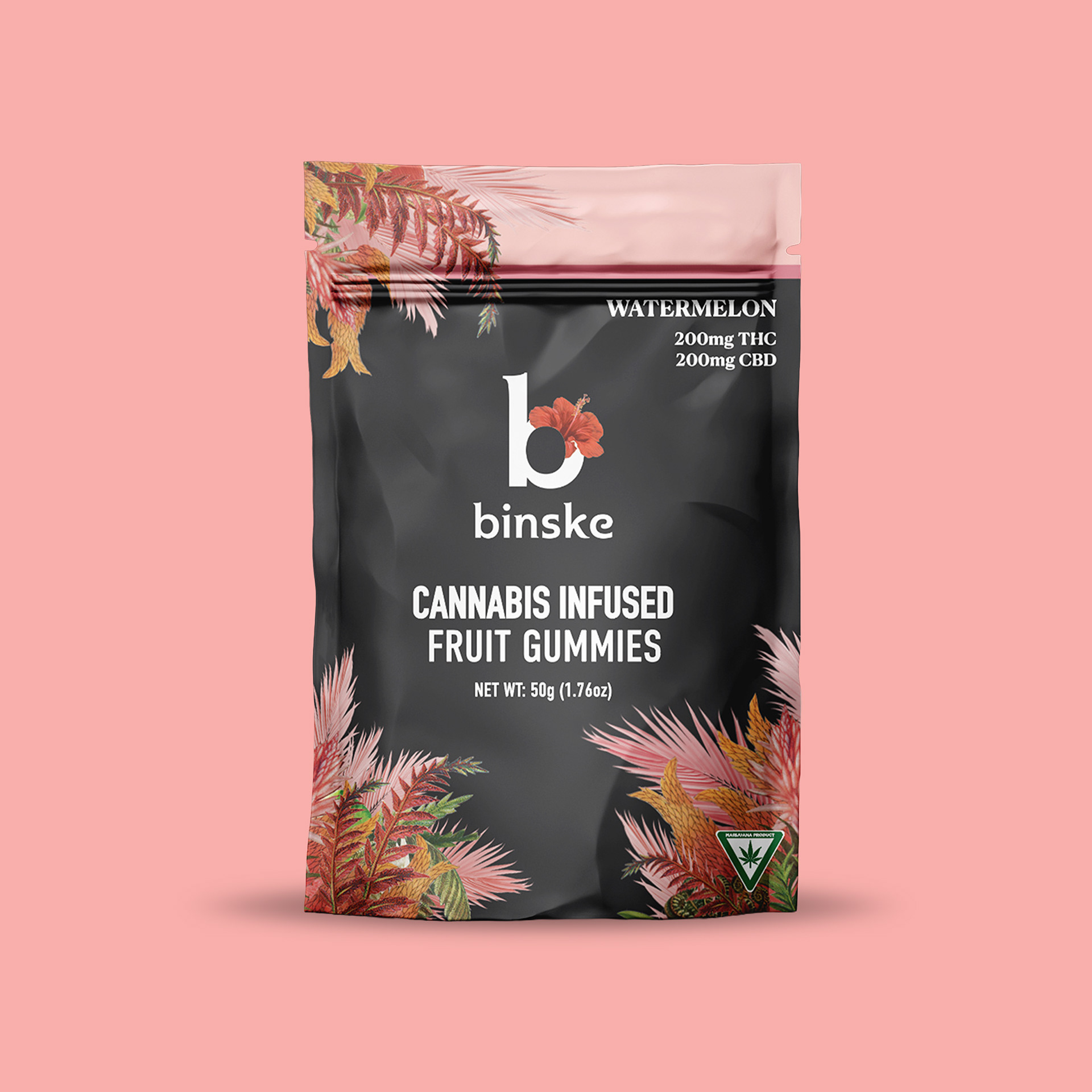
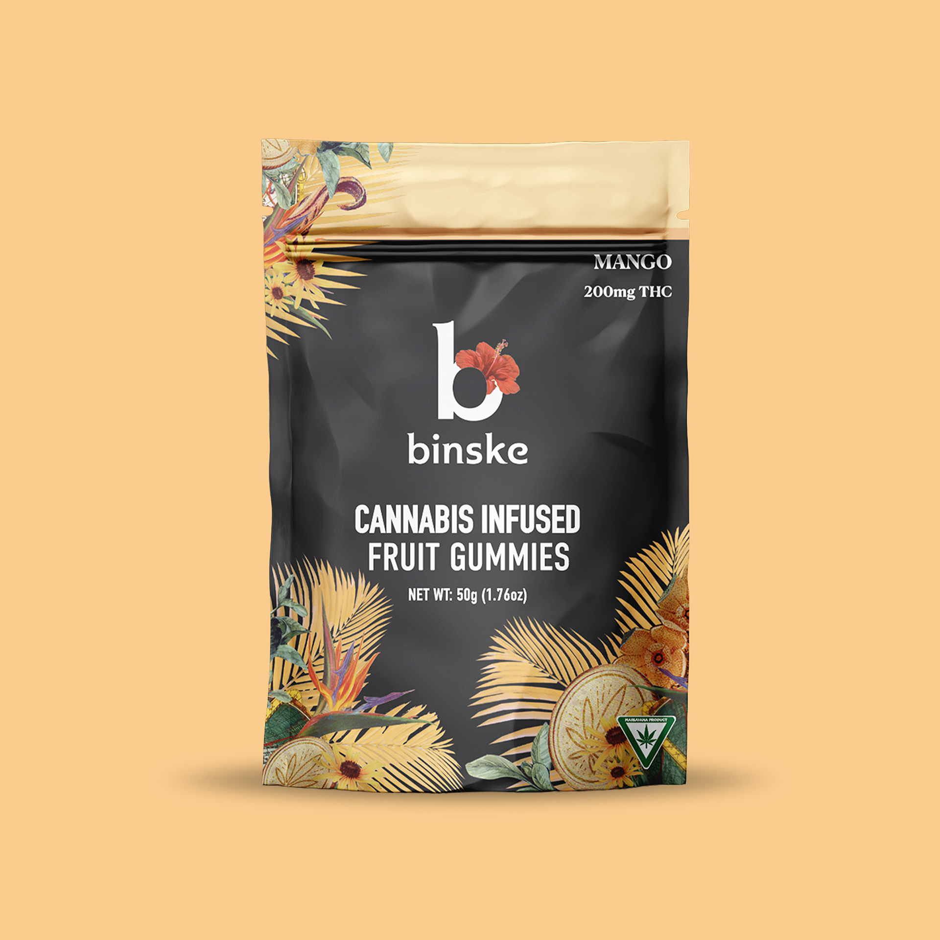
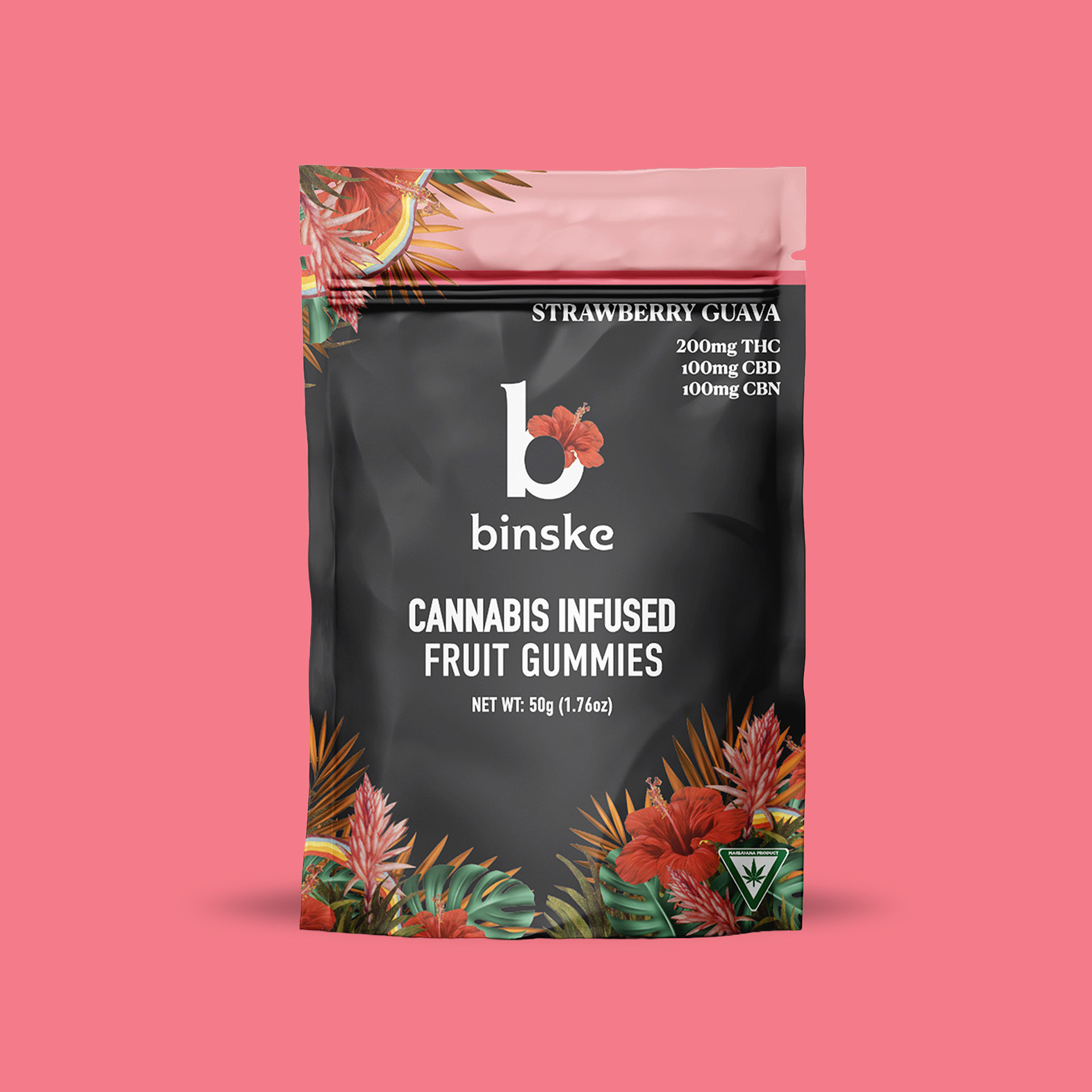

Launch assets: In support of the Sales team, these digital launch assets were used for social media and in store screens. These assets were paired with brand identification slides and are intended to be flavor forward at a glance and to feature the wide assortment of cannabinoids and ratios.
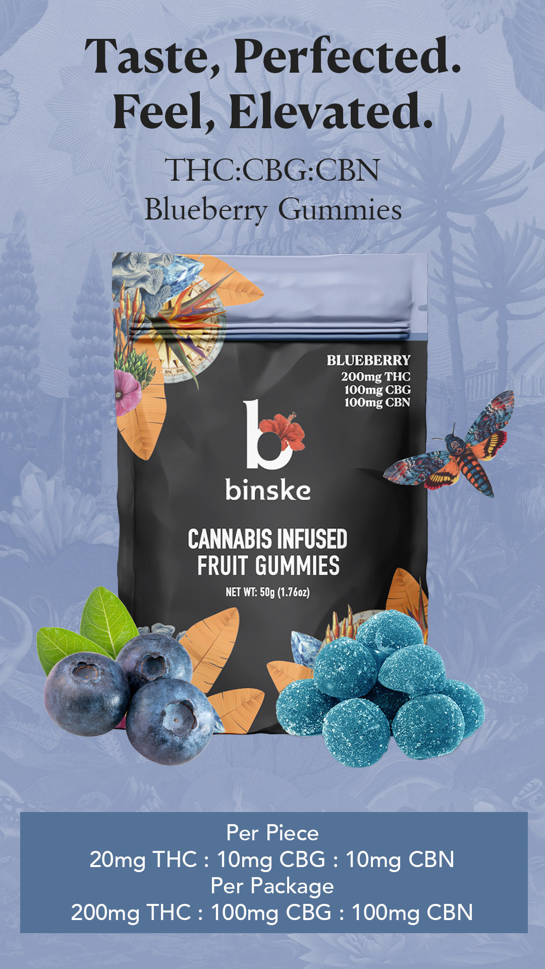
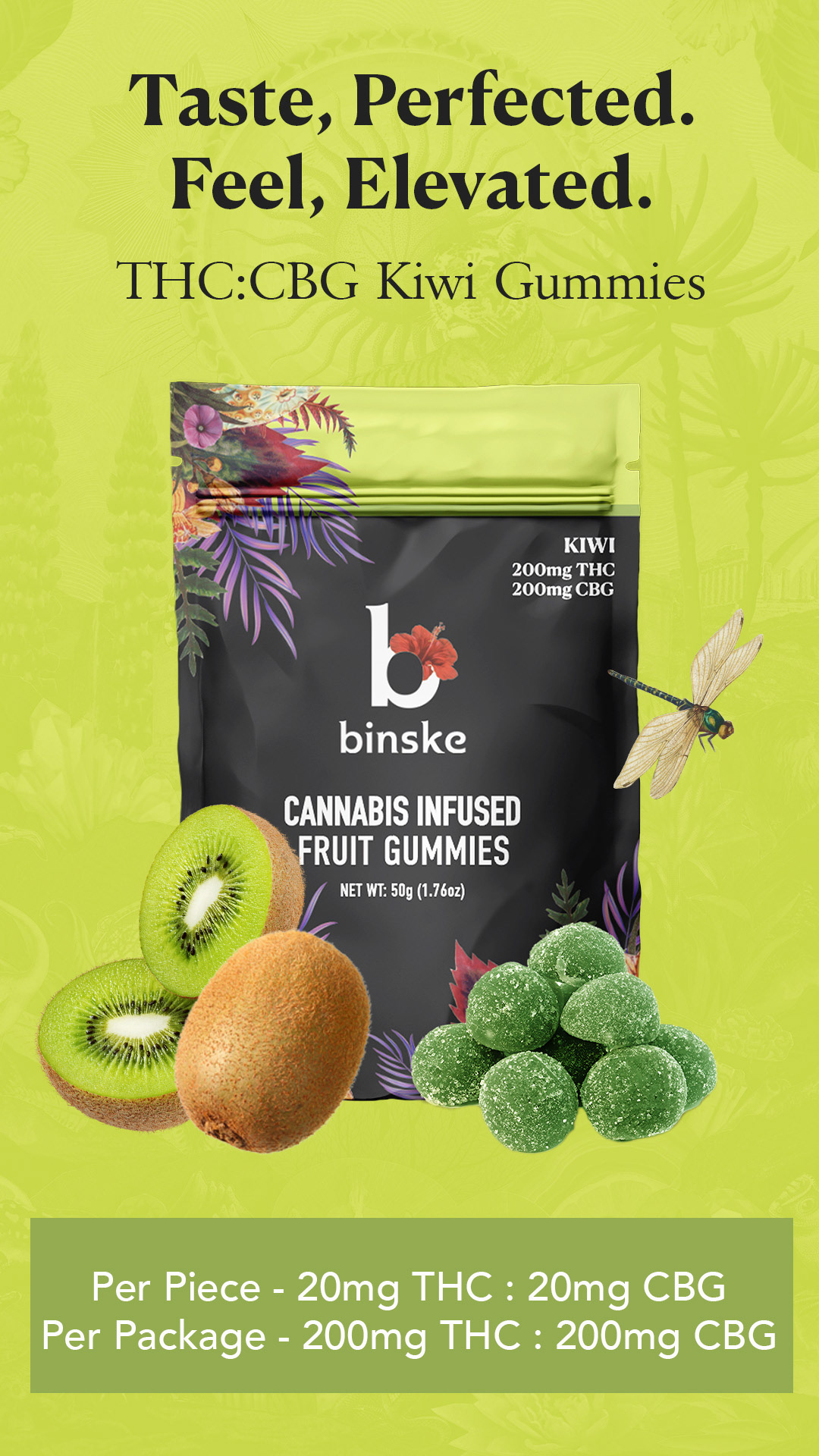
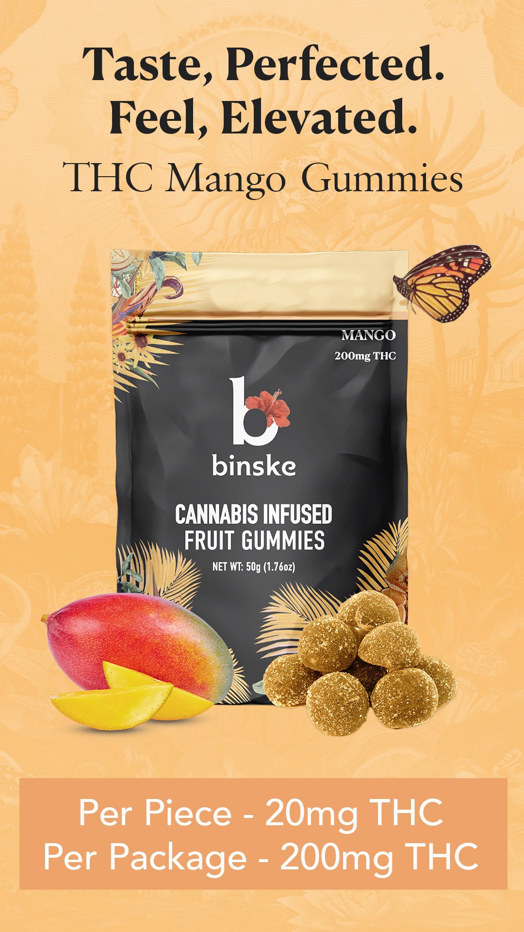
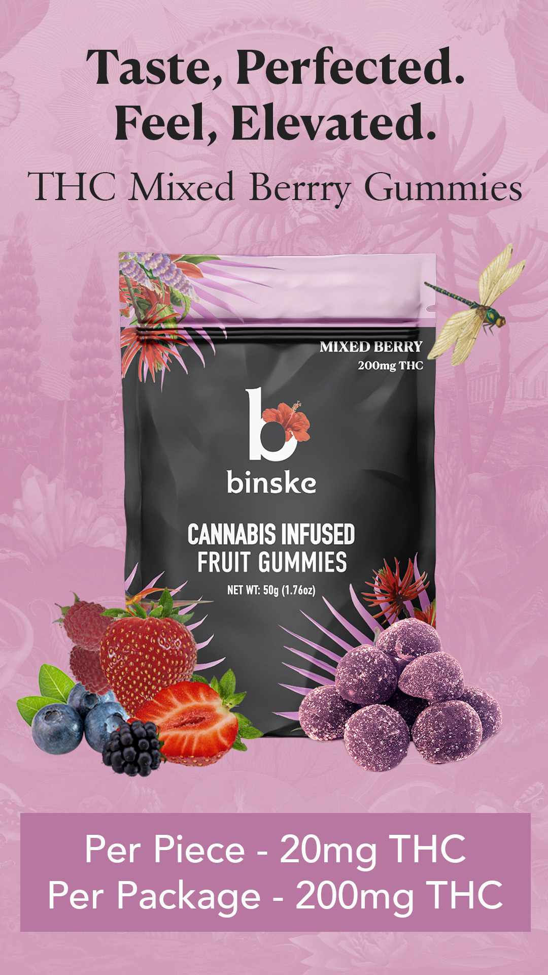
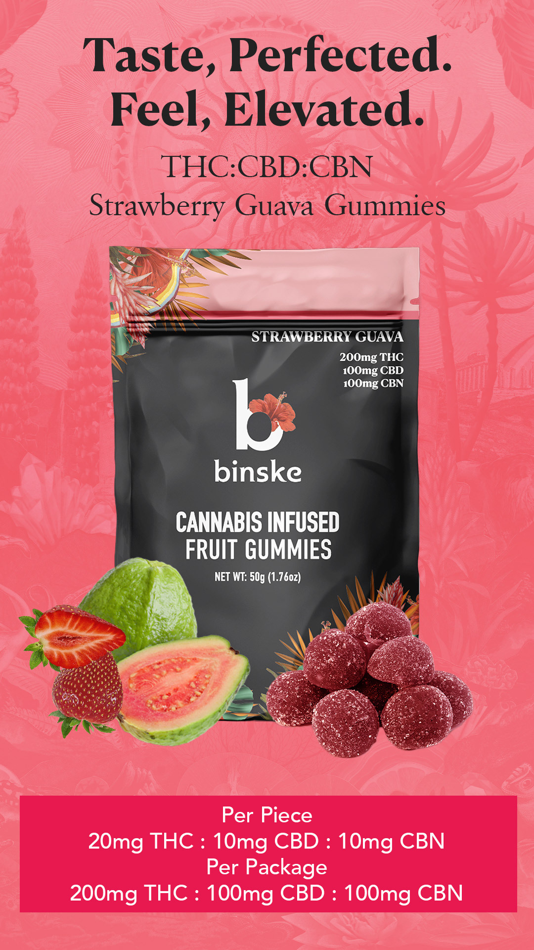
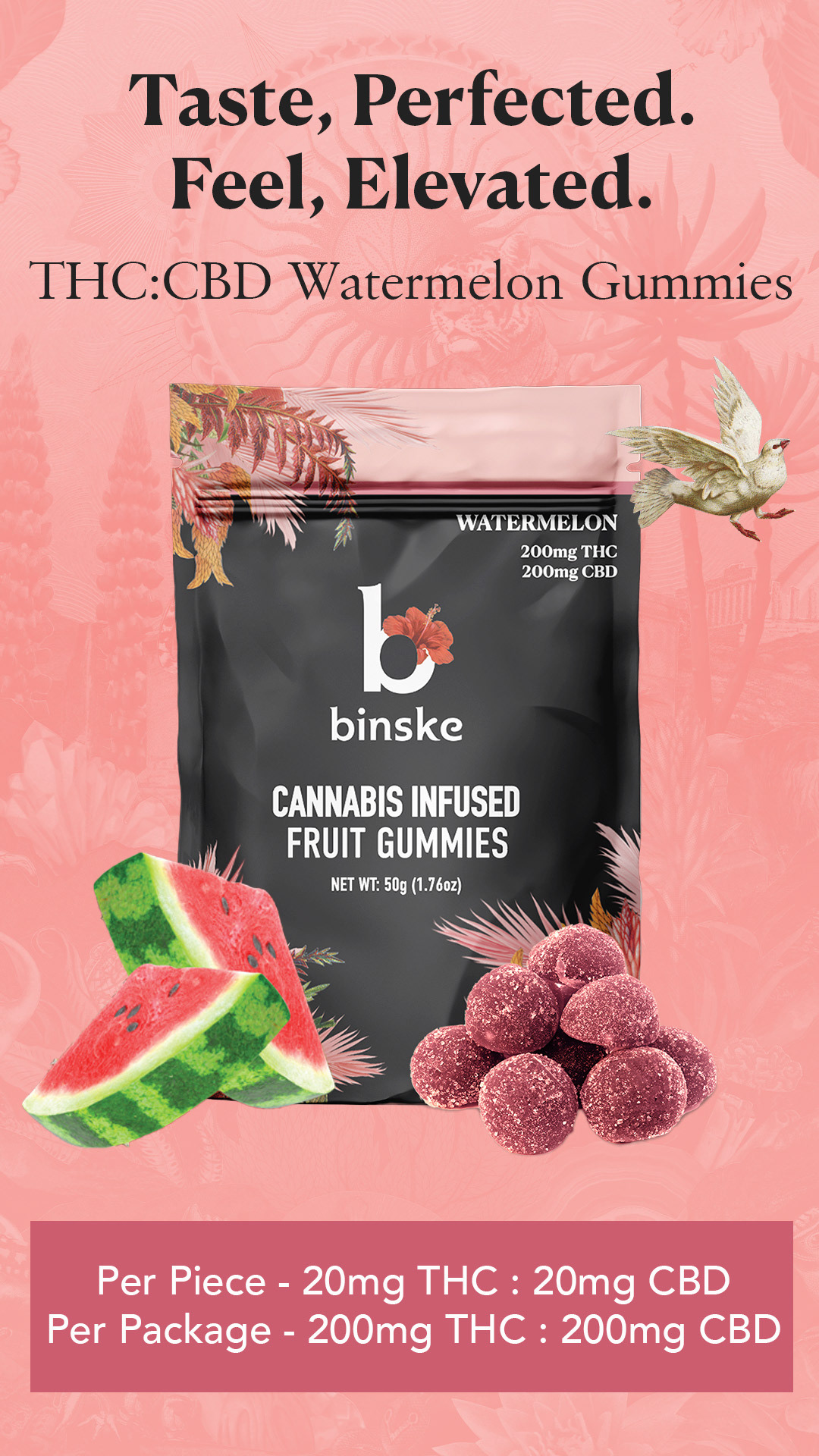
Marketing assets: For each individual flavor, I used the floral assets chosen for the packaging to create product images where they appeard to be bursting from the packaging. Marketing could utilize these in various campaigns and formats. These templates allowed editorial space for headlines and calls to action.
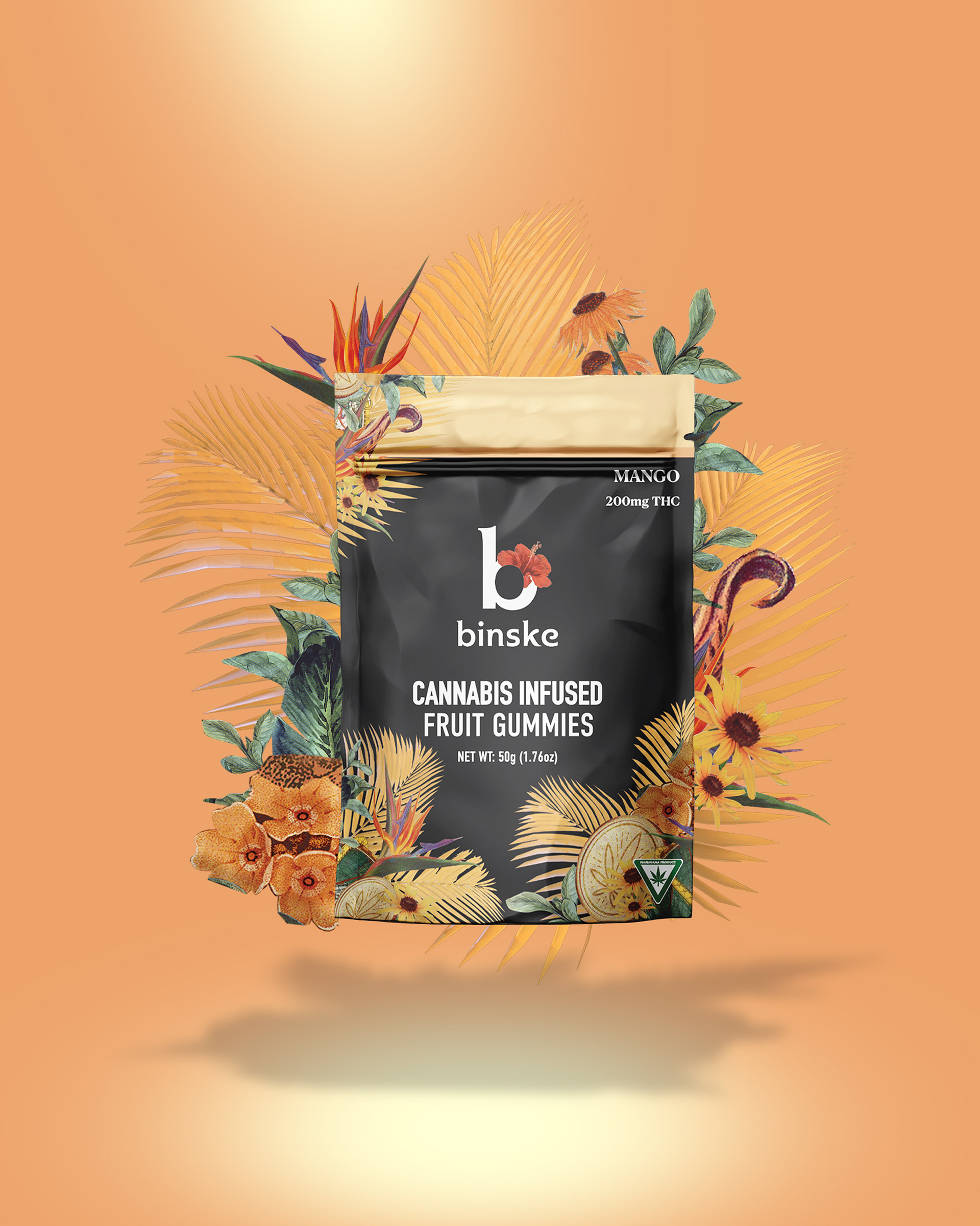
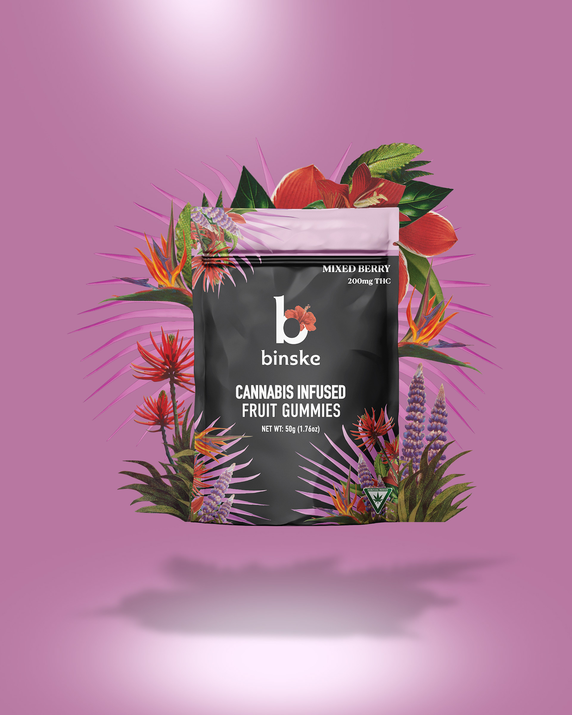
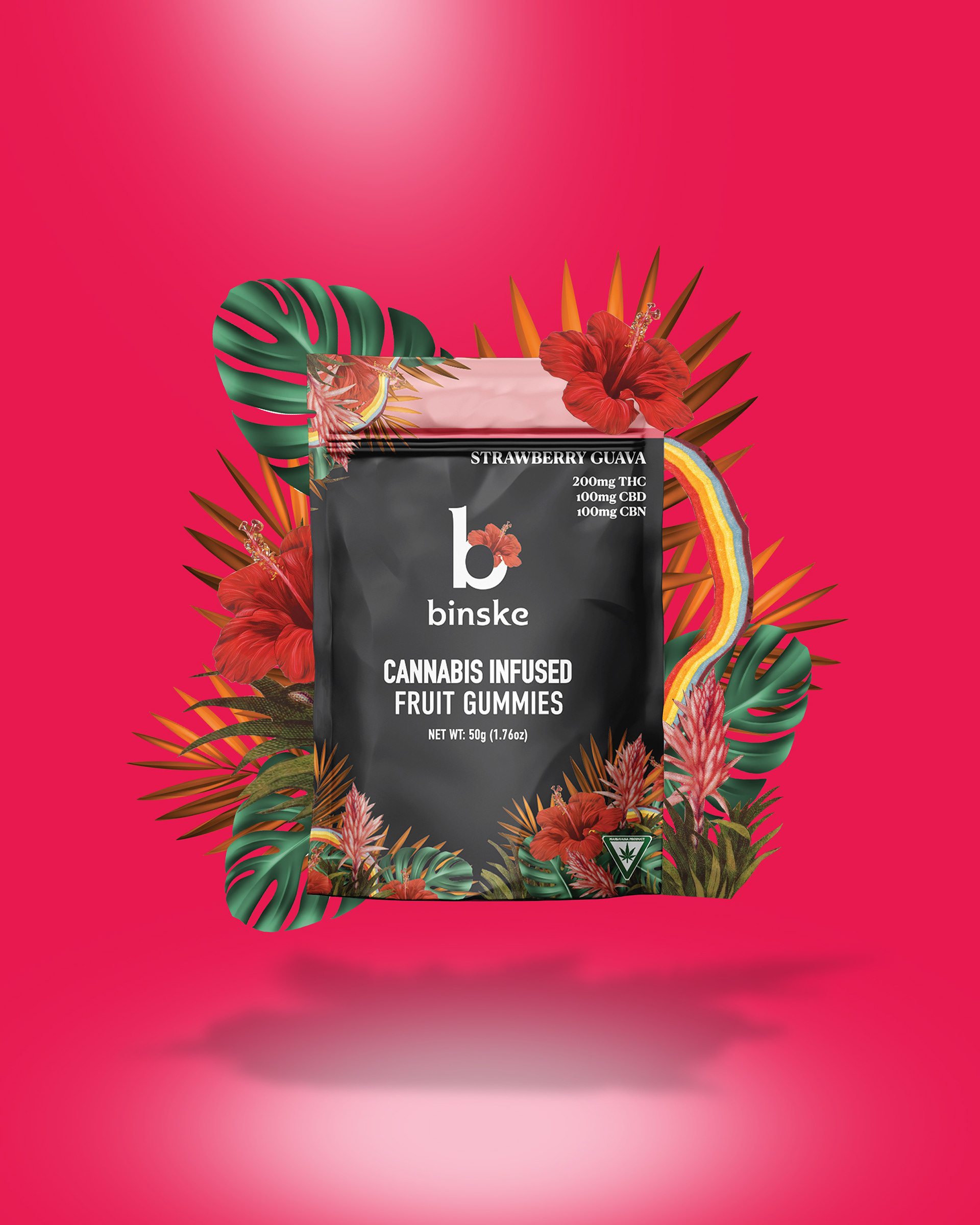
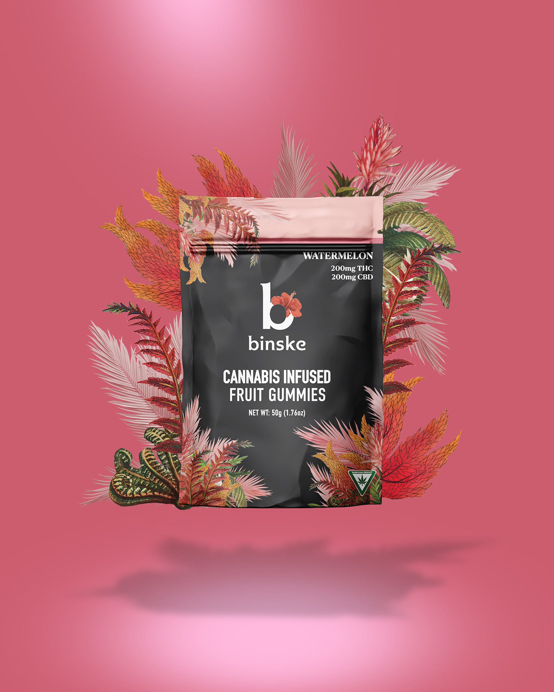

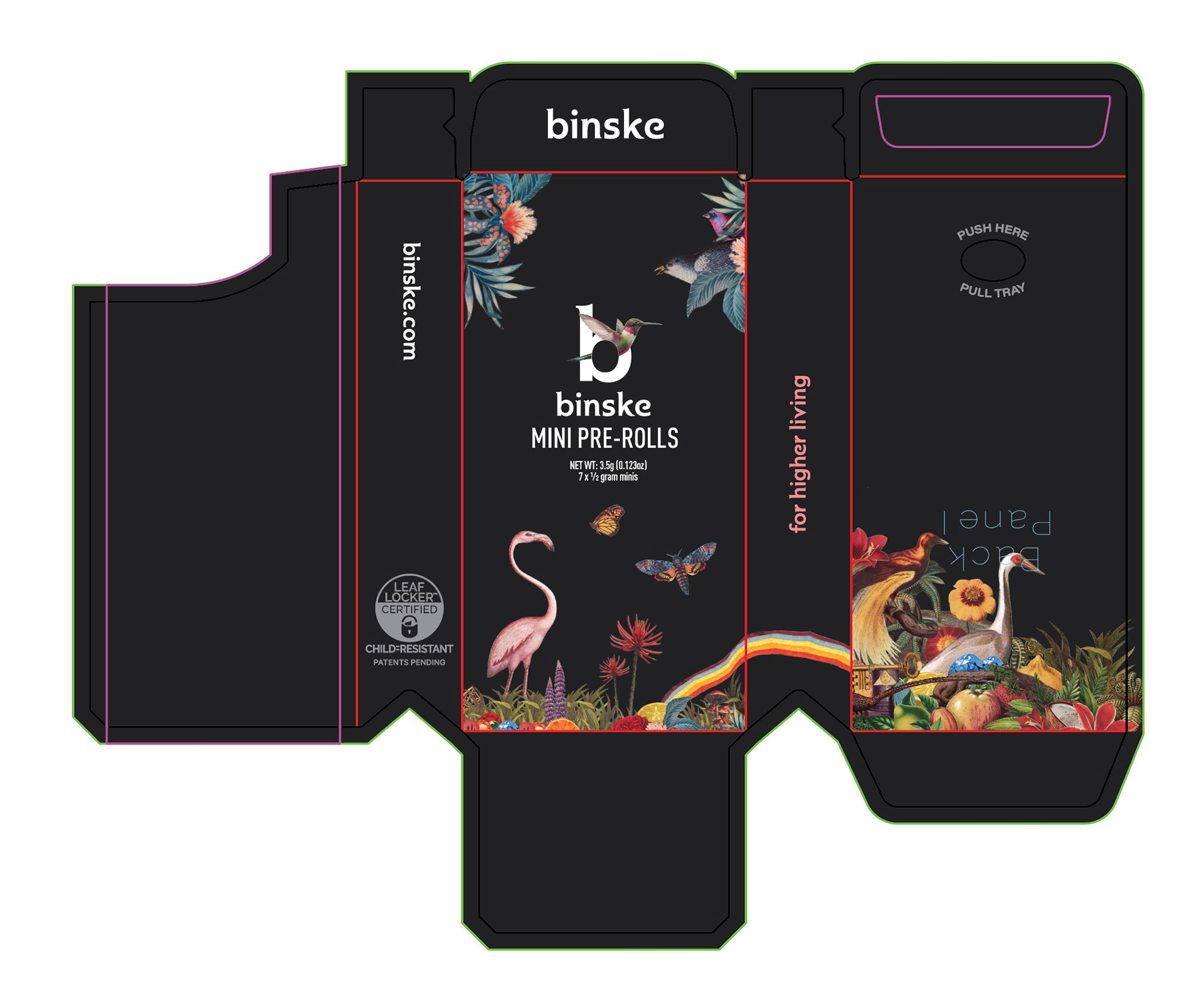
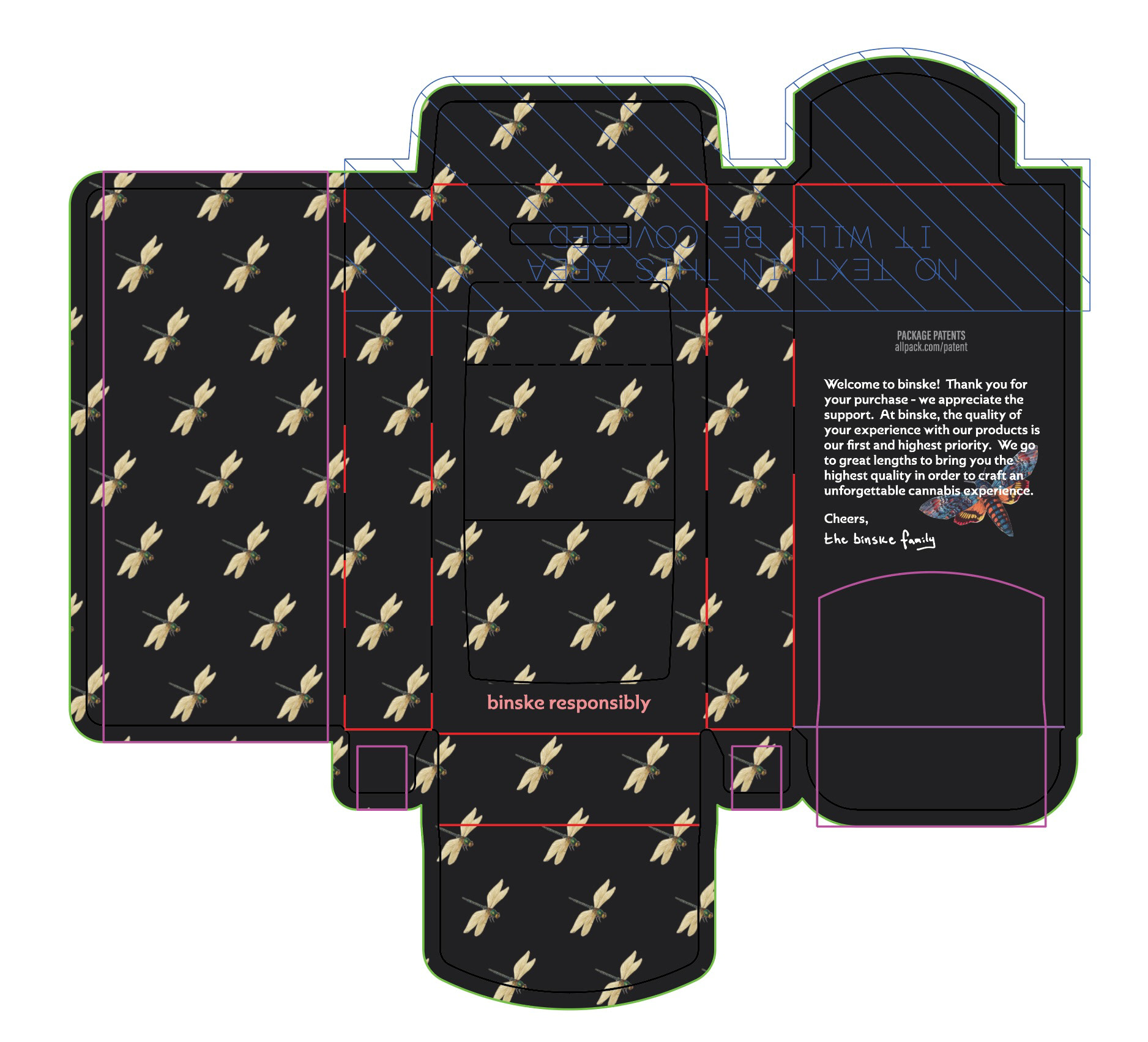
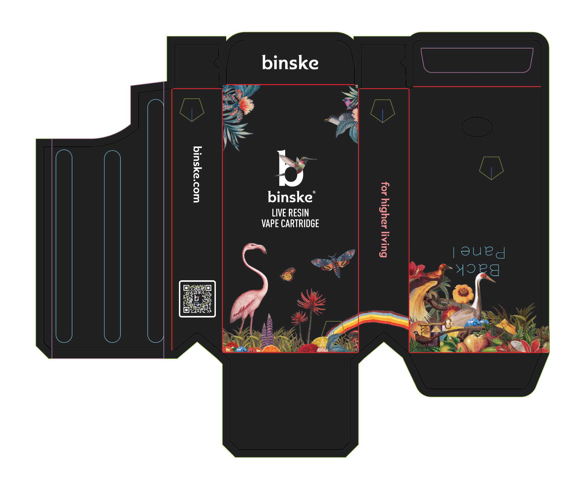
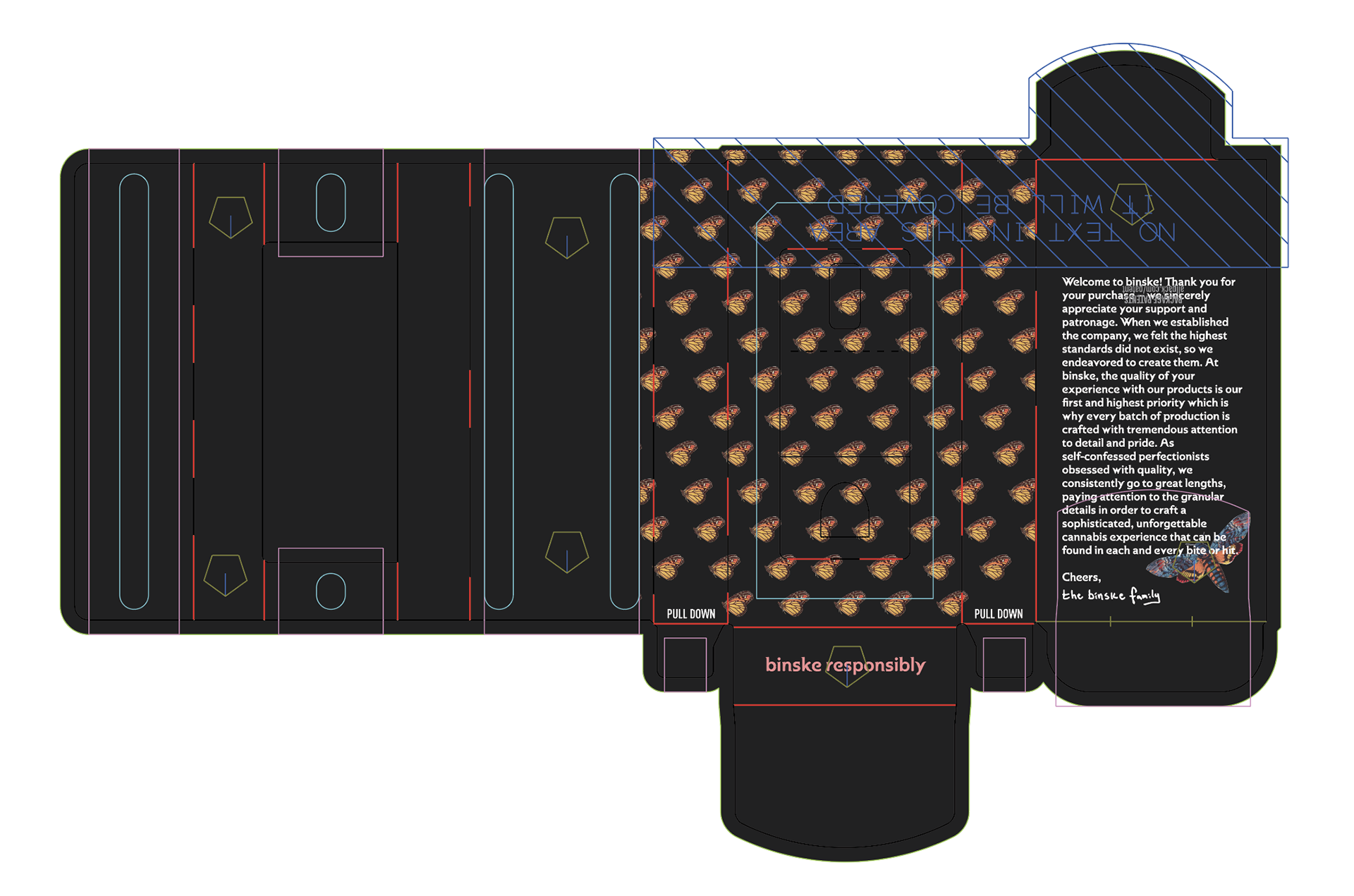
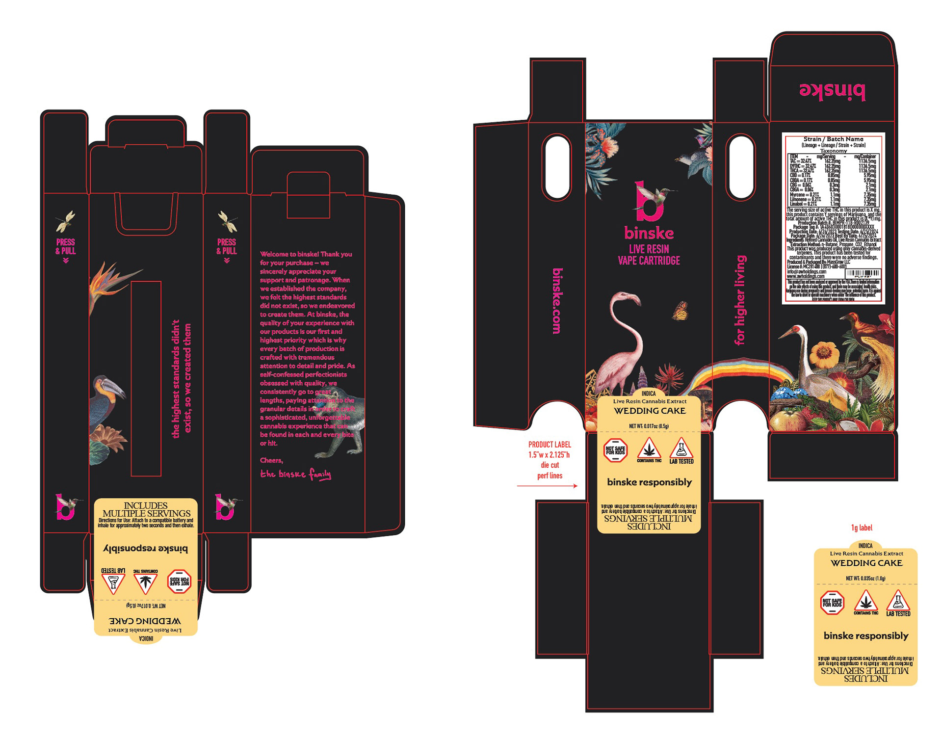
Product Dielines and Labeling: Full understanding of how to read product dielines while understanding the product structure allows me to design on brand, within spec, and compliant. I have translated many brand products packaging designs through several iterations of packaging styles. Considerations were made for compliance labeling and product labels.
All images owned by Praetorian Global Inc.